

Home Blog Page 5

iHerb International Shipping Guide: Costs, Delivery Times & Customs Tips

I’ll be honest — I almost didn’t write this guide. Shipping supplements internationally sounds about as exciting as reading the fine print on a customs form. But after placing dozens of orders from iHerb to multiple countries (and learning a few expensive lessons along the way), I realized this is exactly the kind of information I wish someone had laid out for me years ago.

iHerb shopping review image

Whether you’re a first-time buyer wondering if iHerb even ships to your country, or a seasoned customer trying to figure out why your last order got hit with customs fees, this guide covers the practical stuff: real costs, actual delivery windows, and the tricks that have saved me both money and headaches.

Shipping Methods: What’s Actually Available

iHerb doesn’t do a one-size-fits-all approach to shipping, which is both a blessing and a minor source of confusion. The options you see at checkout depend entirely on where you live, how heavy your order is, and what’s in your cart.

Here’s the general breakdown:

  • Standard Shipping — The budget-friendly default. Uses a mix of carriers depending on your region. Think postal services, local couriers, and sometimes lesser-known logistics companies. It’s slower, but it works.
  • Expedited / Express Shipping — Usually fulfilled through DHL, FedEx, or UPS. Faster, trackable end-to-end, and generally more reliable for clearing customs quickly. Costs more, obviously.
  • Economy Shipping — Available in select regions. The cheapest option, but you’re looking at the longest wait times. I’ve had economy shipments to Southeast Asia take close to three weeks.

One thing that catches people off guard: not every shipping method is available for every product. Liquids, powders over a certain weight, and items containing alcohol (like certain tinctures) sometimes restrict you to specific carriers. You won’t know until you’re at checkout, which can be a bit annoying if you’ve already built a carefully curated cart.

Estimated Delivery Times by Region

Let me be upfront — these are estimates based on my experience and what iHerb publishes. Actual delivery times vary wildly depending on your country’s postal system, whether there’s a holiday backlog, and honestly, a bit of luck.

Region Standard Shipping Expedited Shipping Free Shipping Threshold
United States 4–8 business days 1–3 business days ~$20 USD
Europe (Western) 7–14 business days 3–7 business days ~$40 USD
East Asia (Japan, Korea, Taiwan) 5–10 business days 2–5 business days ~$40 USD
Southeast Asia 7–15 business days 3–7 business days ~$40 USD
Australia / New Zealand 7–14 business days 3–6 business days ~$40 USD
Middle East (UAE, Saudi Arabia) 7–14 business days 3–7 business days ~$40 USD
South America 10–21 business days 5–10 business days ~$40 USD

Note: Free shipping thresholds change periodically and can vary by specific country. Always check at checkout for the most current figures.

A few things worth noting from that table. US orders are obviously the fastest — iHerb’s warehouses are based domestically, so that’s no surprise. For Europe, I’ve found that orders to Germany, the UK, and the Netherlands tend to arrive on the faster end, while Eastern European countries can push toward that 14-day mark. In Asia, Japan and South Korea are impressively quick — I’ve had expedited orders arrive in Seoul in literally three days.

Free Shipping: How to Qualify (and When It’s Worth It)

The free shipping threshold is one of the main reasons my iHerb orders tend to be bigger than I originally planned. For US customers, it’s relatively easy to hit — around $20 typically gets you free standard shipping. International orders generally need to reach around $40, though this number fluctuates.

Here’s my honest take: if you’re within $5–$8 of the free shipping threshold, it almost always makes sense to add another item. Shipping costs for international orders can easily run $5–$15 depending on weight and destination, so throwing in an extra bottle of vitamin D or a snack bar to cross the threshold is just smart math.

That said, don’t fall into the trap of over-ordering just to get free shipping and then getting hit with higher customs duties because your order value is too high. More on that in the customs section below — it’s genuinely important.

How to Track Your iHerb Order

Tracking is straightforward, thankfully. Once your order ships, iHerb sends you a confirmation email with a tracking number. You can also find it in your account under “Orders.”

Tracking Tips

  • Expedited orders (DHL, FedEx, UPS) — Track directly on the carrier’s website. Updates are frequent, usually every few hours, and you get real-time customs clearance status.
  • Standard/Economy orders — These often use a combination of carriers. The tracking might show detailed updates while in the US, then go silent for a few days during international transit, then pick back up when it hits your local postal system. Don’t panic during the silent period — it’s normal.
  • Use third-party trackers — Sites like 17Track or Parcelsapp are genuinely useful for standard shipments. They aggregate tracking data from multiple carriers and often show updates that iHerb’s own tracking page misses.

One frustration I’ll mention: standard shipping tracking can sometimes just… stop updating. The package still arrives, but the last scan might say “departed origin country” for a week before it shows up at your door. If you’re the type who checks tracking obsessively (no judgment, I’m the same way), expedited shipping is worth the extra cost for the peace of mind alone.

Customs, Import Duties & How to Not Get Surprised

Alright, this is the section that’ll save you real money. Customs duties are the hidden cost of international shopping that nobody thinks about until they get a notice from their local post office saying they owe $30 to pick up their vitamins.

How Import Duties Work

Every country has a de minimis threshold — the value below which imported goods are exempt from customs duties and taxes. If your order exceeds this threshold, you may owe import duty, VAT, or GST on the entire shipment.

Country / Region De Minimis Threshold (approx.) Notes
United States $800 USD Very generous; rarely an issue
European Union €150 (duty); €0 (VAT via IOSS) VAT collected at checkout through IOSS
United Kingdom £135 VAT typically collected at point of sale
Australia $1,000 AUD GST collected at checkout for low-value goods
Japan ¥16,666 ~$110 USD; personal-use imports taxed at 60% of value
South Korea $150 USD Health supplements category may have lower limits
UAE AED 1,000 5% VAT applies on most goods
Brazil $50 USD Import taxes can be steep; 60% duty is common

Practical Tips to Minimize Customs Fees

These are strategies I’ve actually used — not theoretical advice from someone who’s never ordered internationally:

  • Keep orders below your country’s de minimis threshold. This is the single most effective thing you can do. If the threshold in your country is $150, keep your order at $140 and place a second order next week. Two smaller orders with no duties beat one big order with a $40 customs bill.
  • Check if iHerb collects VAT/GST at checkout. For EU, UK, and Australian customers, iHerb typically collects the applicable tax at the point of sale through schemes like IOSS. This means you shouldn’t be charged again at delivery — but keep your receipt handy just in case your local customs office doesn’t get the memo.
  • Avoid restricted items. Some countries restrict or outright ban the import of certain supplements. Melatonin is prescription-only in several European countries, for example. If customs flags a restricted item, your entire shipment can get held up — even the items that are perfectly legal.
  • Choose expedited shipping for borderline orders. This sounds counterintuitive, but DHL and FedEx have dedicated customs brokerage teams that clear packages faster and with fewer issues than when a package sits in a postal customs queue for days.

Packaging Quality: Does Your Stuff Arrive Intact?

This is something I genuinely appreciate about iHerb. Their packaging is noticeably better than a lot of online retailers I’ve ordered from. Orders come in sturdy corrugated boxes with air pillows or paper padding to keep everything snug. I’ve ordered glass bottles of liquid supplements multiple times and never had one arrive broken.

They also do something clever with product arrangement — heavier items go at the bottom, lighter items on top, and fragile products get extra bubble wrap. It’s a small thing, but when you’re ordering internationally and your package is getting tossed around in transit for two weeks, it matters.

The only minor complaint: the boxes are sometimes oversized for the contents. I once received a single bottle of probiotics in a box that could’ve held a dozen. Not a huge deal, but if you care about packaging waste, it’s worth noting.

Temperature-Sensitive Items: What You Need to Know

This is where things get a little tricky. Probiotics, certain oils, and some specialty supplements need to be kept cool. iHerb handles this in a few ways:

  • Insulated packaging — Temperature-sensitive items are shipped with insulated liners and sometimes ice packs during warmer months, especially for US domestic orders.
  • Seasonal restrictions — During extreme heat periods, iHerb may temporarily restrict shipping of certain items to hot-climate destinations. This is frustrating if you’re trying to order probiotics in July to the Middle East, but it’s honestly better than receiving a product that’s been compromised.
  • Shelf-stable formulations — Many probiotic brands on iHerb (like Jarrow Formulas and California Gold Nutrition) offer shelf-stable versions specifically designed for shipping. If you’re ordering to a warm climate, look for these.

My recommendation: if you live somewhere hot, order temperature-sensitive items during cooler months, or opt for expedited shipping to minimize time in transit. I’ve done both, and it makes a noticeable difference.

What Happens If Something Goes Wrong?

Packages get lost. Items arrive damaged. It happens. Here’s the good news: iHerb‘s customer service for shipping issues is actually pretty solid in my experience.

  • Missing packages — If tracking shows delivered but you didn’t receive it, or if the package simply stops updating for an extended period, contact their support. I’ve gotten full refunds or re-shipments for lost orders twice without much hassle.
  • Damaged items — Take photos of the damage (both the packaging and the product) and submit them through the support portal. They typically process replacements or credits within a few days.
  • Customs seizure — This one’s tougher. If your order gets seized due to restricted items, iHerb can sometimes refund the product cost, but they can’t do much about the items themselves. This is why checking your country’s import restrictions before ordering is so important.

Final Shipping Tips from Someone Who’s Been There

After years of ordering from iHerb internationally, here are the habits I’ve developed:

  • Consolidate wisely. Aim for that free shipping threshold, but don’t exceed your customs limit. It’s a balancing act.
  • Order early. If you’re running low on a supplement, don’t wait until the bottle is empty. International shipping means you need a buffer of at least two weeks, sometimes more.
  • Save on shipping by comparing methods at checkout. iHerb shows you multiple options with estimated dates. Sometimes the price difference between standard and expedited is only $2–$3 — and the time difference is a full week.
  • Create a wishlist. Instead of making impulse purchases, add items to your wishlist and batch them into a single well-planned order. Your wallet and your customs agent will both thank you.
  • Check for shipping promos. iHerb regularly runs free shipping promotions or reduced shipping rates, especially during sales events. Timing your order around these can save a meaningful amount.

International shipping doesn’t have to be complicated or expensive. With a little planning — keeping orders under customs thresholds, choosing the right shipping speed for your needs, and ordering temperature-sensitive items strategically — you can get your supplements delivered reliably almost anywhere in the world.


Ready to try it?
See the latest details on the official website.

Visit Official Website

Opens in a new tab.

20 Best-Selling Products on iHerb Worth Buying in 2026

I’ll be honest — I’ve spent an embarrassing amount of money on iHerb over the years. What started as a single order for vitamin D turned into a full-blown habit: supplements, serums, snacks, cleaning products — you name it, it’s probably sitting in my cabinet right now. But here’s the thing: not everything on that site is worth your money. Some products genuinely deliver. Others? Pure hype.

iHerb shopping review image

So I put together this list of 20 products that have either earned a permanent spot in my routine or come so highly recommended by the community that I had to try them myself. These aren’t random picks. They’re consistent best-sellers across categories, backed by thousands of reviews, and — most importantly — they actually work.

Let’s get into it.

Supplements That Actually Earn Their Keep

Supplements are the bread and butter of iHerb, and honestly, the sheer volume of options can be paralyzing. I’ve narrowed it down to the ones that keep showing up in best-seller lists for a reason.

1. Doctor’s Best High Absorption Magnesium (100 mg, 240 Tablets)

Price range: $12–$16

This is probably the most universally recommended magnesium supplement on iHerb, and I get why. It uses chelated magnesium glycinate, which is significantly easier on the stomach than cheaper magnesium oxide forms. People swear by it for sleep quality and muscle cramps. If you’ve never tried supplementing magnesium before, this is the one to start with.

Best for: Anyone dealing with poor sleep, muscle tension, or general stress.

2. NOW Foods Magnesium Citrate (200 mg, 250 Tablets)

Price range: $10–$14

A more budget-friendly alternative to the Doctor’s Best option. Magnesium citrate has decent absorption and doubles as gentle digestive support. It’s been a top seller for years, and at this price point, it’s hard to argue with.

Best for: Budget-conscious shoppers who also want mild digestive benefits.

3. NOW Foods Vitamin D-3 (5,000 IU, 240 Softgels)

Price range: $11–$15

The value here is almost absurd — you’re getting nearly eight months of vitamin D for around twelve bucks. NOW Foods keeps things simple: vitamin D3 in olive oil for absorption, no unnecessary fillers. It’s consistently one of the top five best-selling supplements on the entire site.

Best for: Pretty much everyone, especially if you work indoors or live in a region with limited sunshine.

4. Sports Research Vitamin D3 + K2 (5,000 IU, 60 Softgels)

Price range: $13–$17

If you want to get a little fancier with your D3, this combo adds vitamin K2 (MK-7 form) to help direct calcium to your bones rather than your arteries. The coconut oil base is a nice touch too. Smaller bottle, but the K2 pairing makes it worth the slight premium.

Best for: People supplementing higher-dose vitamin D long-term who want proper calcium metabolism support.

5. California Gold Nutrition Omega-3 Premium Fish Oil (180 EPA/120 DHA, 240 Softgels)

Price range: $14–$18

California Gold Nutrition is iHerb’s in-house brand, and their fish oil is legitimately good. It’s IFOS 5-star certified for purity, and the price undercuts most comparable brands by 30-40%. No fishy burps, which is honestly my primary criteria for any fish oil product.

Best for: Anyone wanting a solid daily omega-3 without paying premium brand prices.

6. Nordic Naturals Ultimate Omega (1,280 mg, 60 Softgels)

Price range: $24–$30

The premium pick. Nordic Naturals consistently ranks among the most trusted fish oil brands, and their Ultimate Omega delivers a higher concentration of EPA and DHA per capsule. Yes, it costs more. But the triglyceride form offers superior absorption, and the lemon flavoring genuinely eliminates any aftertaste.

Best for: People who want higher-potency omega-3s and don’t mind paying for top-tier quality.

7. California Gold Nutrition LactoBif Probiotics (30 Billion CFU, 60 Capsules)

Price range: $12–$16

Another win from the in-house brand. Eight probiotic strains, 30 billion CFU, and they’re shelf-stable — no refrigeration needed. I’ve tried fancier probiotics that cost three times as much and honestly didn’t notice a difference. This one just works.

Best for: Anyone new to probiotics or looking for a reliable daily option without the premium price tag.

8. Jarrow Formulas Jarro-Dophilus EPS (25 Billion, 60 Capsules)

Price range: $20–$26

The EnteroGuard coating on these is the selling point — it protects the probiotics through stomach acid so more actually reach your intestines. If you’ve tried cheaper probiotics and felt like they did nothing, this delayed-release technology might be the upgrade you need.

Best for: People who want verified delivery of live cultures past the stomach.

Skincare Favorites That Keep Selling Out

The skincare section on iHerb has blown up in the last couple of years, especially for K-beauty and clean beauty products. These are the ones that consistently fly off the virtual shelves.

9. Beauty of Joseon Relief Sun: Rice + Probiotics (SPF 50+ PA++++)

Price range: $12–$16

If you haven’t heard of this sunscreen yet, where have you been? It went mega-viral for good reason — it applies like a lightweight moisturizer, leaves zero white cast, and layers beautifully under makeup. The rice bran and probiotic extracts give it a subtle glow without feeling greasy. This is one of those products that converts people into daily sunscreen users.

Best for: Anyone who hates the feel of traditional sunscreen. Works across all skin tones.

10. COSRX Advanced Snail 96 Mucin Power Essence

Price range: $14–$19

Yes, it’s snail mucin. Yes, it sounds weird. And yes, it’s incredible. This essence has a slightly viscous, serum-like texture that plumps and hydrates without clogging pores. I noticed a real difference in skin texture within about two weeks of daily use. The 96% snail secretion filtrate concentration is no joke.

Best for: Dry or dehydrated skin types looking for deep hydration and repair.

11. Wishtrend Pure Vitamin C 21.5% Advanced Serum

Price range: $16–$22

This is a serious vitamin C serum at a fraction of what Western brands charge for similar concentrations. The 21.5% L-ascorbic acid formula is potent — you might feel a mild tingle on first use. Sea buckthorn extract rounds it out nicely. Just store it properly (cool, dark place) because pure vitamin C oxidizes fast.

Best for: Experienced skincare users wanting to brighten skin tone and fade dark spots.

12. Heimish All Clean Balm (120 ml)

Price range: $14–$18

This sherbet-textured cleansing balm melts away sunscreen and makeup without stripping your skin. It’s become a staple in double-cleansing routines. The shea butter base keeps things comfortable even for sensitive skin types, and a little goes a surprisingly long way.

Best for: Anyone who wears sunscreen or makeup daily and wants a thorough first cleanse.

Natural Beauty Essentials

These are the unglamorous-but-essential products that quietly rack up tens of thousands of reviews.

13. Sierra Bees Organic Lip Balm Variety Pack (8 Pack)

Price range: $5–$8

Eight lip balms for under eight dollars. They’re beeswax-based, organic, and come in flavors like pomegranate, mint burst, and cocoa butter. I keep one in every jacket pocket, every bag, every drawer. At this price, losing one doesn’t even sting. There’s a reason this is perpetually in iHerb’s top 20.

Best for: Literally everyone. Stock up and forget about it.

14. Life-flo Pure Rosehip Seed Oil (30 ml)

Price range: $8–$12

Cold-pressed, unrefined, and that deep amber color tells you the nutrients are intact. Rosehip oil is packed with vitamins A and C and essential fatty acids, making it phenomenal for fading scars and evening out skin tone. A few drops mixed into your moisturizer at night — that’s the move.

Best for: People dealing with hyperpigmentation, fine lines, or post-acne marks.

15. Acure Brightening Facial Scrub (118 ml)

Price range: $8–$11

Sea kelp and French green clay in a gentle physical exfoliant. It’s effective without being abrasive, which is rare for scrubs at this price point. I use it twice a week and my skin always looks noticeably fresher the next morning. Clean ingredients, no sulfates, no parabens — checks all the boxes.

Best for: Normal to oily skin types wanting a no-fuss weekly exfoliant.

Organic Snacks You’ll Actually Crave

I’ll admit I didn’t expect to become someone who orders snacks from iHerb, but some of these are genuinely hard to find elsewhere — especially at these prices.

16. Navitas Organics Cacao Nibs (227 g)

Price range: $8–$12

If you like dark chocolate, cacao nibs are the real deal — pure cacao with no added sugar. They’re crunchy, intensely chocolatey, and packed with antioxidants. I toss them into oatmeal, smoothie bowls, and trail mix. Fair warning: they’re bitter on their own, so pair them with something sweet.

Best for: Health-conscious chocolate lovers and smoothie bowl enthusiasts.

17. California Gold Nutrition Organic Spirulina (500 mg, 240 Tablets)

Price range: $8–$11

Okay, spirulina isn’t exactly a “snack,” but people add it to smoothies and juices like candy, so it fits. This USDA organic spirulina is a powerhouse of protein, B vitamins, and iron. The tablet form is convenient if you can’t stand the taste of spirulina powder (and trust me, I can’t).

Best for: Smoothie addicts and anyone wanting a nutrient-dense green supplement.

18. Made in Nature Organic Dried Mangoes (85 g)

Price range: $5–$8

No sugar added, no sulfur dioxide, just organic mangoes. These are chewy, tart-sweet, and dangerously addictive. One bag never lasts more than two sittings in my house. They’re also great for kids — way better than fruit snacks from the grocery store.

Best for: Families, office snackers, and anyone trying to replace processed sweets.

Household Products That Surprised Me

This is the category I slept on the longest. Turns out, some of the best deals on iHerb aren’t supplements at all.

19. Mrs. Meyer’s Clean Day Multi-Surface Everyday Cleaner, Lavender (473 ml)

Price range: $5–$8

Smells incredible, actually cleans well, and the ingredients list won’t make you wince. I’ve tried the basil and lemon verbena scents too, but lavender remains my go-to. It handles kitchen counters, bathroom surfaces, and stovetops without any harsh chemical residue.

Best for: Anyone who wants effective cleaning products that don’t smell like a chemistry lab.

20. Dr. Bronner’s Pure-Castile Liquid Soap, Peppermint (473 ml)

Price range: $10–$14

The Swiss Army knife of soaps. I’ve used this as hand wash, body wash, dish soap, and even diluted it for mopping floors. The peppermint scent has a cooling tingle that’s especially nice in summer. It’s concentrated, so one bottle lasts months if you dilute properly. Fair trade, organic, and somehow still affordable.

Best for: Minimalists who love multi-purpose products and want to simplify their household supplies.

Quick Comparison: Top Picks by Category

Category Top Pick Price Range Why It Stands Out
Magnesium Doctor’s Best High Absorption $12–$16 Gentle chelated form, great for sleep
Vitamin D NOW Foods D-3 5,000 IU $11–$15 Unbeatable value — 8 months per bottle
Fish Oil California Gold Nutrition Omega-3 $14–$18 IFOS certified, no fishy aftertaste
Probiotics CGN LactoBif 30 Billion $12–$16 Shelf-stable, 8 strains, great price
Sunscreen Beauty of Joseon Relief Sun $12–$16 No white cast, moisturizer-like finish
Face Oil Life-flo Rosehip Seed Oil $8–$12 Cold-pressed, fades scars effectively
Snacks Made in Nature Dried Mangoes $5–$8 No added sugar, genuinely delicious
Household Dr. Bronner’s Peppermint Soap $10–$14 Multi-purpose, concentrated, organic

A Few Tips Before You Hit “Add to Cart”

After years of ordering from iHerb, here are some things I wish I’d known sooner:

  • Watch for “Trials & Specials” — iHerb rotates discounts weekly, and popular items from this list frequently show up at 15-25% off.
  • Check expiration dates on supplements — best-sellers tend to have fresh stock, but it’s still worth a glance, especially on larger bottles.
  • Combine orders to hit the free shipping threshold — the minimum varies by region, but grouping your purchases saves a surprising amount over time.
  • Read the 1-star reviews, not just the 5-star ones — they’ll tell you if a product has issues specific to your needs (taste, texture, sensitivity reactions).
  • Store vitamin C serums in the fridge — seriously, they oxidize fast in warm climates and turn orange. Cold storage extends shelf life significantly.

That’s my honest rundown of the 20 products I think are genuinely worth your attention on iHerb right now. Not every product will be perfect for everyone — your body chemistry, skin type, and preferences will always play a role. But if you’re staring at a massive catalog and feeling overwhelmed, this list is a solid place to start.

Ready to try it?
See the latest details on the official website.

Visit Official Website

Opens in a new tab.

iHerb vs Amazon for Supplements: Which Platform Wins on Price, Quality & Trust?

I’ll be honest — I used to buy everything on Amazon. Groceries, electronics, dog toys, and yes, supplements. Prime shipping is addictive. But after a sketchy experience with a bottle of vitamin D3 that smelled like paint thinner and had a suspiciously peeled safety seal, I started asking a question I probably should’ve asked years earlier: is Amazon actually the best place to buy supplements?

iHerb shopping review image

That question led me down a rabbit hole, and eventually to iHerb — a platform I’d heard about but never really explored. After spending the last two years buying from both platforms (and meticulously comparing receipts, shipping times, and product quality), I’ve got a lot of thoughts. So let’s break this down category by category.

The Price Battle: Who Actually Charges Less?

This is what everyone wants to know first, so let’s get into it. I tracked prices on a handful of popular supplements across both platforms over several months. Prices fluctuate, but the patterns are pretty consistent.

Real Price Comparisons (Checked Mid-2026)

Product iHerb Price Amazon Price Notes
NOW Foods Magnesium Citrate, 200mg, 250 tablets ~$11.50 ~$11.00–$14.99 Amazon price varies wildly by seller
Garden of Life Dr. Formulated Probiotics, 50 Billion, 30 caps ~$33.59 ~$29.99–$38.00 Amazon’s lowest is often a third-party seller
California Gold Nutrition Omega-3 Fish Oil, 240 softgels ~$13.00 ~$16.50+ iHerb house brand, cheaper at source
Sports Research Vitamin D3+K2, 60 softgels ~$13.56 ~$13.56–$15.99 Often identical; Amazon Subscribe & Save can edge lower
Doctor’s Best High Absorption CoQ10, 100mg, 120 softgels ~$18.90 ~$17.49–$22.00 Amazon’s best price usually requires Subscribe & Save

Here’s what I noticed: Amazon’s lowest price sometimes beats iHerb, but that lowest price often comes from a third-party seller you’ve never heard of. When you compare Amazon’s “Sold by Amazon” price or the brand’s official Amazon storefront, iHerb is frequently cheaper or within a dollar.

Where iHerb really pulls ahead is with its own house brands — California Gold Nutrition, Lake Avenue Nutrition, and others. These are solid, well-tested products that are significantly cheaper than comparable options on Amazon because there’s no middleman markup. Also, iHerb regularly runs loyalty credits and combo deals that shave another 5–10% off if you know where to look.

Authenticity and Counterfeit Risks: The Elephant in the Room

Let me be blunt: this is where the comparison gets uncomfortable for Amazon.

Amazon’s marketplace model means that multiple sellers — including random third parties — can list the same product. Worse, Amazon uses a system called “commingled inventory” where products from different sellers get mixed together in the same warehouse bin. So even if you buy from the “official” brand listing, the actual bottle you receive might have been sourced from a completely different seller.

There have been well-documented cases of counterfeit supplements showing up on Amazon. From fake protein powders to adulterated herbal extracts, it’s a real problem. The FDA has issued warnings. Brands themselves have spoken out about unauthorized sellers on Amazon peddling expired or tampered products.

How iHerb Handles Sourcing Differently

iHerb operates on a fundamentally different model. They buy directly from manufacturers and brands — no third-party sellers, no marketplace free-for-all. Every product in their warehouse was sourced through an authorized channel. They also run their own climate-controlled fulfillment centers, which matters a lot for probiotics and fish oils that degrade in heat.

Is it theoretically possible to get a bad product from iHerb? Sure, nothing’s perfect. But the structural risk is dramatically lower. You’re not gambling on which random seller’s inventory you’ll receive. You know where it came from.

For me personally, this was the tipping point. Once I understood how Amazon’s commingled inventory worked, buying premium supplements there started to feel like a coin flip I didn’t need to take.

Shipping Speed and International Reach

If you live in the U.S. and have Prime, Amazon wins on speed. Period. Next-day or same-day delivery is tough to beat for sheer convenience.

iHerb typically ships within 1–2 business days from their California warehouse, and domestic orders usually arrive in 3–5 days. Not blazing fast, but perfectly reasonable. Where iHerb genuinely shines is international shipping. They ship to over 185 countries with localized pricing, duties/taxes calculated at checkout, and surprisingly affordable shipping rates. If you’re outside the U.S., iHerb is often the better — and sometimes the only practical — option for getting authentic supplements at fair prices.

Amazon’s international supplement shipping is hit-or-miss. Many supplement listings are restricted from international shipping, and when they are available, the added costs can be brutal.

Product Selection: Breadth vs. Depth

Amazon has more stuff — no question. You can find virtually any supplement brand on Amazon, including tiny indie brands, random imported products, and discontinued items from resellers.

But more isn’t always better. iHerb carries over 30,000 products from around 1,800 brands, which covers all the major players: NOW Foods, Solgar, Nature’s Way, Garden of Life, Life Extension, Thorne (select products), Doctor’s Best, and many more. They’ve also expanded heavily into K-beauty, natural foods, and personal care — so it’s not just supplements anymore.

The difference is curation. iHerb vets the brands they carry. Amazon lets anyone sell anything (within their broad guidelines). If you want a specific niche product from a micro-brand, Amazon might have it. But for mainstream, quality-tested supplements? iHerb’s catalog is more than deep enough.

Customer Reviews: Helpful or Hopeless?

Amazon’s Review Problem

Amazon’s review ecosystem is… compromised. There’s a whole industry of fake reviews, incentivized reviews, and review manipulation. Fakespot and ReviewMeta exist for a reason. I’ve seen supplement listings with thousands of five-star reviews that read like they were written by the same person (or, let’s be real, the same bot). Vine reviews help, but they’re a drop in the ocean.

iHerb’s Review System

iHerb requires a verified purchase to leave a review, and they don’t run an equivalent of Amazon’s Vine program. The reviews tend to be shorter and more genuine — regular people sharing whether a product worked for them. Are there still some questionable reviews? Probably. But the overall signal-to-noise ratio is noticeably better. I actually trust a 4.2-star rating on iHerb in a way I don’t on Amazon.

Return Policies and Customer Service

Amazon’s return policy is famously generous — you can return almost anything within 30 days, often with free return shipping. For supplements, this is a solid safety net, especially if you receive a damaged or suspicious product.

iHerb offers a 60-day return window on most products, which is actually longer than Amazon’s. However, the process is a bit more involved — you typically need to contact their support team, and return shipping may not always be free depending on the reason. For damaged or defective items, they’re generally responsive and will issue refunds or credits without too much hassle.

Neither platform is perfect here, but both are reasonable. I’d call this one roughly a draw, with Amazon having a slight edge on the ease of returns and iHerb winning on the length of the return window.

The Full Comparison at a Glance

Category iHerb Amazon Winner
Pricing Competitive; house brands are a steal Can be lower via Subscribe & Save 🤝 Tie
Authenticity Direct from brands; no third-party sellers Commingled inventory; counterfeit risks ✅ iHerb
Shipping (U.S.) 3–5 days standard 1–2 days with Prime ✅ Amazon
Shipping (International) 185+ countries; affordable rates Limited; often restricted or pricey ✅ iHerb
Product Selection 30,000+ curated products Virtually unlimited listings ✅ Amazon
Review Trustworthiness Verified purchase only; more authentic Volume is high but manipulation is rampant ✅ iHerb
Return Policy 60-day window 30-day window; easier process 🤝 Tie
Storage & Handling Climate-controlled warehouses Standard fulfillment; varies ✅ iHerb

When Amazon Still Makes Sense

Look, I’m not here to tell you to never buy supplements on Amazon. There are situations where it’s the right call:

  • You need something today (or tomorrow). Prime speed is unmatched. If you ran out of your daily multivitamin and need it ASAP, Amazon delivers — literally.
  • You’re buying from the brand’s own Amazon storefront. Some brands like Sports Research and Nature Made run their own Amazon stores with inventory they control. This significantly reduces the counterfeit risk.
  • Subscribe & Save pricing is genuinely better. For a few products, the Subscribe & Save discount on Amazon creates a price gap that’s hard to ignore — especially if you stack it with coupon clips.
  • You want a very niche or discontinued product. Amazon’s long tail of third-party sellers means you can sometimes find products that are out of stock everywhere else.

When iHerb Is the Smarter Choice

For most supplement buyers — especially those who care about what they’re putting in their bodies — iHerb comes out ahead in the areas that matter most:

  • You want guaranteed authenticity. No third-party seller roulette. No commingled inventory. Every product sourced directly from the brand.
  • You buy temperature-sensitive supplements. Probiotics, fish oils, certain vitamins — these degrade in heat. iHerb’s climate-controlled storage matters more than most people realize.
  • You live outside the U.S. iHerb’s international infrastructure is years ahead of Amazon’s when it comes to supplements.
  • You prefer curated quality over endless choice. Sometimes having fewer options — but better-vetted ones — is a feature, not a limitation.
  • You want honest reviews from real buyers. iHerb’s review system isn’t perfect, but it’s dramatically less corrupted than Amazon’s.

My Bottom Line

After two years of buying from both platforms, here’s where I’ve landed: I buy about 80% of my supplements on iHerb and 20% on Amazon. The 80% on iHerb covers my regular stack — magnesium, fish oil, probiotics, vitamin D, and a few specialty items. The peace of mind knowing I’m getting authentic products, stored properly, at competitive prices is worth the extra day or two of shipping.

The 20% on Amazon? That’s for the odd product iHerb doesn’t carry, or the occasional emergency restock where I need something by tomorrow morning.

If you haven’t tried iHerb yet, it’s worth at least putting together a test order and comparing. Move one or two of your regular products over and see how the experience compares. I think you’ll notice the difference — not just in price, but in the overall quality of the experience. And honestly? In the confidence you feel opening that bottle.

Ready to try it?
See the latest details on the official website.

Visit Official Website

Opens in a new tab.

iHerb Review 2026: Is It Legit? Pricing, Shipping & Real User Experience

I’ve been ordering from iHerb for over six years now — probably close to 80 orders at this point. So when people ask me, “Is iHerb legit?” I don’t have to guess. I’ve dealt with their shipping, their customer service, their returns process, and pretty much every quirk the platform has. This is the review I wish I’d found before placing my first order.

iHerb shopping review image

What Exactly Is iHerb?

If you haven’t come across it yet, iHerb is an online retailer based in Irvine, California, that specializes in supplements, natural health products, beauty items, and groceries. They’ve been around since 1996 — which, fun fact, makes them older than Google. They ship to over 185 countries, and their warehouse operations are climate-controlled, which matters a lot more than you’d think when you’re buying probiotics or fish oil in the middle of July.

What sets them apart from a random supplement shop on the internet is scale. They carry over 30,000 products from roughly 1,800 brands. We’re talking everything from mainstream names like NOW Foods, Nature’s Way, and Garden of Life to niche organic skincare brands most people haven’t heard of. They’re not a marketplace in the Amazon sense — iHerb sources and stores products directly, which gives them tighter control over quality and storage conditions.

Product Categories: More Than Just Vitamins

Most people discover iHerb because they’re looking for a specific supplement. But the catalog is genuinely broad. Here’s a rough breakdown of what you’ll find:

  • Supplements: Vitamins, minerals, amino acids, herbal extracts, probiotics, omega-3s — this is the bread and butter. The selection here is honestly unmatched.
  • Beauty & Personal Care: Clean beauty products, natural shampoos, serums, sunscreens. Brands like Andalou Naturals, Acure, and Jason are well-stocked.
  • Grocery: Organic snacks, superfoods, coconut oil, nut butters, protein bars, teas, and spices. I personally grab Bob’s Red Mill oats and Frontier Co-op spices here regularly.
  • Bath & Household: Natural cleaning products, essential oils, laundry detergent. Seventh Generation, Mrs. Meyer’s, that sort of thing.
  • Baby & Kids: Children’s vitamins, baby skincare, organic baby food pouches.
  • Sports Nutrition: Protein powders, BCAAs, creatine, pre-workouts from brands like Optimum Nutrition, MusclePharm, and Dymatize.
  • Pet Care: Yes, really. Pet supplements and natural pet food options.

The search and filtering system is decent — not perfect, but you can narrow by brand, price range, ratings, dietary preference (vegan, gluten-free, non-GMO), and more. Each product page includes the supplement facts label, which I appreciate because a surprising number of competitors don’t bother.

Pricing: How Does iHerb Compare?

Let’s get into the numbers, because this is usually what seals the deal. I’ve done side-by-side comparisons on products I buy regularly, and the savings are real — though they vary depending on what you’re buying and where you live.

Product iHerb Price Amazon Price Local Pharmacy
NOW Foods Vitamin D3 5000 IU (240 softgels) $12.49 $13.99 $17.99
Garden of Life Dr. Formulated Probiotics (30 caps) $29.74 $31.49 $39.99
Nature’s Way Sambucus Elderberry Gummies (60 ct) $14.39 $15.29 $19.49
Optimum Nutrition Gold Standard Whey (2 lb) $30.99 $30.49 $36.99

In general, iHerb tends to beat Amazon by a small margin on most supplements, and it significantly undercuts local pharmacy and health food store prices. The exception? Occasionally Amazon will have lightning deals or Subscribe & Save discounts that edge ahead. But those prices fluctuate constantly, while iHerb’s tend to stay more stable.

What pushes the value even further is iHerb’s rotating deals. They run category-specific sales (20% off all probiotics, 15% off a specific brand, etc.) weekly, and there’s almost always a sitewide coupon floating around. If you’re patient and strategic, you can stack savings pretty effectively.

Shipping Options and Costs

Shipping is honestly one of iHerb’s strongest selling points, especially if you’re ordering from outside the U.S. They offer multiple shipping tiers:

  • Free shipping: Available on orders over $20 in many countries (the threshold varies by location). For the U.S., it’s typically free over $20 with standard shipping.
  • Economy shipping: The cheapest option for international orders, usually taking 7–14 business days. Costs range from $4 to $8 depending on your country.
  • Standard/Expedited: 5–10 business days, prices vary. For the U.S., expect 3–7 days with free shipping on qualifying orders.
  • DHL/FedEx Express: For when you need things fast. International express typically arrives in 3–5 business days. Not cheap — expect $10–$20+ — but reliable.

I’m based in Asia, and my orders typically arrive in about 8–10 days with the standard option. Tracking is provided for every shipment, and the packaging is solid — products arrive well-cushioned, with ice packs included for heat-sensitive items during summer. I’ve only had one package arrive damaged out of all my orders, and that was a jar of coconut oil with a cracked lid. Not bad odds.

One thing to watch: customs duties. Depending on your country, orders above a certain value may incur import taxes. iHerb is transparent about this and lists duty thresholds by country, but it’s on you to stay under the limit if you want to avoid extra fees.

Product Authenticity: Can You Trust What You’re Getting?

This is the big question, and rightfully so. The supplement industry has a counterfeit problem — especially on third-party marketplace platforms where anyone can list products.

iHerb operates differently. They purchase directly from brands or authorized distributors, store everything in their own climate-controlled warehouses, and handle fulfillment in-house. They also use a system called iTested, where they send products to independent third-party labs to verify identity, potency, and purity. You can actually look up test results on individual product pages — not every product has been tested yet, but the coverage is expanding.

Beyond that, iHerb has a “Best by” date guarantee — if a product arrives past its best-by date, they’ll replace it or refund you. Their warehouses are GMP-certified, and because they control the entire supply chain from purchase to doorstep, the risk of counterfeits is dramatically lower than buying from a random Amazon third-party seller.

In six years of ordering, I’ve never once received a product that seemed off — no broken seals, no missing lot numbers, no sketchy packaging. That’s a track record I trust.

Customer Service: The Good and the Meh

Let me be straight here: iHerb’s customer service is functional but not exceptional. They offer support via email, live chat, and a help center. Response times for email are usually 24–48 hours, which is fine but not blazing fast.

Where they do excel is their returns and refund policy. If something arrives damaged, the wrong item ships, or you’re unhappy for basically any reason, they make it pretty painless. You can request a refund or credit directly through your account — no phone calls, no arguing. For international orders, they typically don’t even ask you to ship the product back. They just issue the credit. I’ve used this twice, and both times it was resolved within a day.

The one gripe I have is that live chat can feel scripted, and complex issues sometimes require multiple exchanges to resolve. It’s not terrible — I’ve dealt with far worse — but it’s not going to win any awards either.

The iHerb Mobile App

I do about 70% of my iHerb shopping on their app, and it’s honestly pretty solid. Available on both iOS and Android, the app mirrors the website experience but feels smoother in a lot of ways. Product browsing is fast, search works well, and the barcode scanner is a neat touch — you can scan a supplement you already have at home to find it on iHerb instantly.

Push notifications for deals can get a bit aggressive if you don’t customize your settings, so I’d recommend tweaking those right after installing. The checkout process is streamlined, saved payment methods work reliably, and order tracking is integrated nicely. It’s not the prettiest app in the world, but it’s functional and dependable, which matters more in my book.

Loyalty and Rewards Program

iHerb’s rewards program is straightforward. You earn Loyalty Credits equal to roughly 5% of your order value, and those credits are automatically applied to your next purchase. They expire after 60 days, which pushes you to reorder within that window — a little nudge, but not unreasonable if you’re a regular buyer.

There’s also a referral program where you can share a code with friends and both parties get a discount. The exact discount varies, but it’s typically around $5 off for new customers. Nothing groundbreaking, but it’s a nice bonus on top of already competitive pricing.

They occasionally run “Super Deals” with markdowns up to 60–70% on certain products nearing their best-by date. These are still perfectly good products with months of shelf life remaining — they’re just being rotated. If you’re not picky about expiration proximity, these deals can be absurdly good.

Pros and Cons at a Glance

✅ Pros ❌ Cons
Massive product selection (30,000+ items) Customs duties can apply on international orders
Competitive pricing, often cheaper than Amazon Loyalty credits expire in 60 days
Ships to 185+ countries with reliable tracking Customer service can feel scripted on live chat
Direct sourcing from brands — minimal counterfeit risk Some product categories have limited brand variety
iTested third-party lab verification Not every product has iTested results available yet
Easy, no-hassle refund process Express shipping costs can add up for international buyers
Free shipping threshold is low ($20 in many countries) Push notifications on the app can be aggressive by default
Climate-controlled warehousing for sensitive products Website design feels functional but slightly dated

So, Is iHerb Worth It in 2026?

After six years and more orders than I care to count — yes. Unequivocally yes. iHerb isn’t perfect, and I’ve laid out the rough edges honestly. But when you weigh the pricing, the product authenticity, the shipping reliability, and the sheer breadth of what they carry, it’s genuinely hard to find a better option for buying supplements and natural products online.

If you’re someone who buys vitamins, supplements, or clean beauty products on any kind of regular basis, the savings alone make it worth trying. And if you’re outside the U.S. — where local options for these products are often limited and wildly overpriced — iHerb is essentially a lifeline.

My honest advice: start with a small order. Pick two or three products you already use, compare the prices, and see for yourself. I’m confident you’ll be back for a second order within the month.

Ready to try it?
See the latest details on the official website.

Visit Official Website

Opens in a new tab.

Clairvoyance Review 2026: Smart Desktop Notifications & Quick-Info Widgets

0

I remember a time, not so long ago, when my agency’s content workflow was less a streamlined process and more a chaotic, multi-headed hydra. As the lead content strategist for a small but ambitious digital marketing firm specializing in tech startups, I was constantly drowning under a deluge of diverse content demands. One moment, I’d be meticulously researching the intricacies of a new blockchain protocol for a client’s in-depth whitepaper, then immediately pivot to crafting snappy, engaging social media updates for a different client’s B2B SaaS launch. Before I could even catch my breath, I’d be tasked with developing a compelling email sequence for a product launch, followed by drafting internal documentation for our own evolving processes. It felt like I was perpetually context-switching, wearing a dozen different hats, each demanding a full day’s worth of focused attention. The mental overhead was immense, and the quality, while never truly suffering thanks to sheer willpower and late nights, was definitely inconsistent in its initial stages.

My attempts to tame this beast were numerous and, frankly, exhausting. We subscribed to a veritable smorgasbord of AI writing tools – one touted for long-form content generation, another specifically for social media captions, and yet another for optimizing email subject lines. My workflow often involved generating ideas in ChatGPT, copying the output into Claude for refinement and tone adjustment, then pasting that into our project management software for team review. It was a fragmented, copy-paste-heavy process that felt incredibly inefficient and prone to errors. We even brought on a part-time virtual assistant to handle some of the initial content research and basic formatting, but even that felt like adding another layer of management and communication rather than truly solving the core problem of scaling our content generation capabilities without sacrificing quality or burning out the team. The combined cost of these multiple AI subscriptions, coupled with the VA’s hours, was steadily eroding our profit margins. The breaking point arrived with the acquisition of a major new client, a Series A funded startup with an aggressive product launch schedule. They needed an entire suite of marketing collateral – ten comprehensive blog posts, four distinct email sequences, fifty unique social media posts, a detailed FAQ section, and an in-depth competitor analysis – all compressed into a tight six-week deadline. To compound the challenge, our lead technical writer went on an unexpected medical leave, leaving me to also oversee critical updates to our internal API documentation for another existing client. I was staring down the barrel of an unavoidable 80-hour work week, fueled by caffeine and a growing sense of panic, acutely aware that our current setup simply couldn’t handle the sheer volume and complexity without severely compromising the quality of our output or, more likely, my personal sanity.

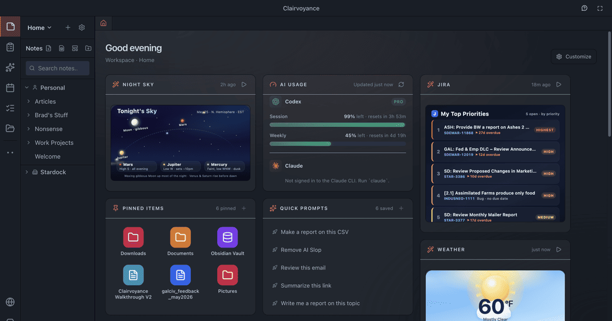
It was during a particularly frantic Tuesday afternoon, with a blank document mocking me from my screen as I struggled to conjure a compelling narrative for a client’s new cybersecurity feature, that a glimmer of hope appeared. My colleague, Mark, usually quite reserved about his tech discoveries, mentioned offhand that he’d been exploring something from Stardock, a company I knew more for desktop utilities and games, that was marketing “AI Staff for Everyone.” He vaguely described it as being fundamentally different from your typical chatbot experience. Intrigued, and frankly desperate, I immediately Googled “Stardock AI staff” and quickly landed on the Clairvoyance website. My initial impression was a complex mix of skepticism and cautious optimism. The claims on the page sounded almost too good to be true: “a team of named, persistent AI agents that work together to build apps, create documents, and analyze data. Not another chatbot.” The promise of local execution, meaning my sensitive client data would remain securely on my machine, was an immediate and significant draw. The idea of “multiple agents, real output, works while you sleep” resonated deeply with my current predicament. The website offered a free download, with the reassuring claim of “30 seconds to install. No Docker. No YAML.” That was the decisive moment. I was so utterly frustrated with my existing, inefficient toolkit and so desperate for a solution that wasn’t just another browser tab or a glorified text editor that I clicked “Download Free” without a moment’s hesitation. I needed something, anything, to alleviate the crushing pressure, and the low barrier to entry for this Clairvoyance review felt like a sign I couldn’t ignore.

The installation process for Clairvoyance was, to my genuine astonishment, precisely as advertised. I downloaded the desktop application, ran the installer, and within a matter of minutes, I was prompted to connect my existing AI provider API keys. I opted to integrate my Claude and OpenAI keys first, as those were the models I relied upon most frequently. The user interface itself was remarkably clean, professional, and felt like a proper, robust desktop application, a refreshing change from the often clunky or overly simplistic web UIs I had grown accustomed to. It immediately conveyed a sense of seriousness and utility, less like a toy and more like a powerful professional tool. My very first real task for my newly acquired “AI staff” involved a dual challenge that perfectly mirrored my daily struggles. For the new cybersecurity client, I needed an initial draft of an email sequence designed to introduce their innovative new feature to existing customers, with a clear focus on articulating benefits and driving a specific call to action. Simultaneously, for the internal API documentation project, I wanted a concise summary of recent changes to a specific module, based on a provided changelog and several code snippets. I created two distinct “agents” within Clairvoyance, consciously naming one “Sally” (envisioning her as my marketing/sales content specialist) and the other “Marcus” (my dedicated technical documentation expert). I provided Sally with the detailed prompt for the email sequence, including the target audience, key selling points, and the desired tone. In parallel, I fed Marcus the changelog and code snippets, instructing him to generate a concise summary of the functional impacts of the recent API modifications.

My honest reaction to the initial output was one of profound, almost stunned, efficiency. While Sally was diligently drafting the first few emails of the sequence, Marcus was already actively processing the complex technical information. The desktop UI visually displayed their progress, almost like watching two virtual assistants typing away simultaneously on their respective tasks. Within approximately 20 minutes, I had a surprisingly good first draft of a 3-email sequence from Sally, complete with relevant subject line suggestions and some compelling body copy. It wasn’t perfect, naturally requiring some adjustments to align with the client’s precise brand voice and to strengthen a few hooks, but it was easily 80% there – a monumental leap forward from the agonizing process of staring at a blank page. Marcus, on the other hand, delivered a clear, well-structured, bullet-pointed summary of the API changes, accurately highlighting potential breaking changes and newly introduced functionalities. It was remarkably accurate, requiring only minimal technical correction from my end. The specific detail that truly surprised and impressed me was the “persistent memory” aspect. When I gave Sally a follow-up instruction to refine one of the email drafts, she remembered the previous context of our conversation and applied the changes intelligently, rather than starting from scratch like a typical stateless chatbot. This was a massive differentiator from my previous copy-paste workflow, where every interaction with an AI tool felt like a fresh, disconnected start. It genuinely felt like having assistants who actually remembered what they were working on and built upon previous instructions.

Clairvoyance review

Now, Clairvoyance has undeniably transitioned from a desperate last resort into an absolutely indispensable part of my daily and weekly workflow. It has fundamentally transformed how I approach content generation and strategic planning for our agency. I’ve since expanded my “AI staff” to include a few more specialized agents, each with a distinct role. “Quinn” has become my dedicated market research analyst, constantly sifting through industry news, competitor reports, and client feedback to provide daily briefings or ad-hoc summaries on emerging trends. “Marcus” continues to be my reliable go-to for all things technical documentation, internal reports, and even drafting initial project proposals that demand a structured, data-driven approach. “Sally” remains my primary content creator for all marketing copy, churning out initial drafts for blog posts, social media campaigns, and email sequences with remarkable speed. I’ve even experimented with a “Leo” for legal-adjacent content, helping me draft disclaimers or privacy policy summaries based on provided legal texts (always, of course, with the explicit understanding that these drafts are for internal review and must be thoroughly vetted by actual legal counsel before any external use).

What Clairvoyance does exceptionally well is orchestrating complex, multi-stage tasks that, in the past, would have required me to manually switch between several different tools and painstakingly maintain context myself. For instance, when we initiate a new client’s content strategy, I can seamlessly assign Quinn to conduct a comprehensive competitive content audit and identify critical content gaps, while Sally simultaneously drafts outline structures for a series of blog posts based on our initial SEO keyword research. The incredible ability for these agents to work in parallel, each operating within their own persistent, specialized contexts, means I can set a series of interconnected tasks and return to a suite of coherent, actionable outputs. This saves me an immense amount of time on the initial, often arduous, heavy lifting. I can confidently say it cuts down my content research and initial drafting time for a comprehensive campaign by at least 60%, and sometimes even more. What used to consume a full day of arduous context-switching, rudimentary drafting across disparate platforms, and constant mental gymnastics is now condensed into a focused hour or two of intelligent prompting and refinement within Clairvoyance. This newfound efficiency allows me to dedicate significantly more of my valuable time to strategic thinking, nuanced client communication, and the final, crucial polish that truly elevates our agency’s output and distinguishes us in the market.

However, it would be disingenuous to present Clairvoyance as a perfect, all-encompassing solution. It’s not a silver bullet, and I’m keenly aware of its limitations. While the platform excels at generating structured content and summarizing vast amounts of information, it still struggles with truly unique, highly creative, or deeply empathetic writing. For example, crafting a brand’s core narrative that aims to evoke specific, complex emotions or developing a groundbreaking headline that truly captures an audience’s imagination often requires a level of human intuition and a nuanced understanding of cultural context that even advanced AI agents simply don’t possess yet. I’ve consistently found that for those “aha!” moments, those flashes of genuine creative brilliance, I still need to step in and infuse the crucial human touch. Occasionally, an agent might get stuck in a repetitive loop, generating similar variations without truly progressing the task, or misinterpret a subtle nuance in a complex prompt, leading to an output that, while technically correct in its composition, is entirely off-brand or misses the intended strategic mark. These instances necessitate pausing the agent, carefully refining the prompt, and sometimes even restarting the task, which can be a minor but nonetheless frustrating annoyance when you’re working against a tight deadline. Compared to my old process, where I was painstakingly drafting every single word myself or micro-managing a freelancer for initial content, the quality difference for initial drafts and research is profound. The time saved is immense, easily justifying the investment. But for that final 10-20% of creative magic, strategic insight, or profound empathy, my human brain is still very much in charge, providing the essential direction and refinement.

One aspect that, despite my overall satisfaction, occasionally grates on me is the resource intensity. When I have multiple agents actively running complex tasks in parallel, especially those involving extensive data processing or intricate code generation, my machine’s CPU and RAM usage can spike quite noticeably. It’s not a constant issue, but when I’m simultaneously trying to run a high-definition video conference or render a complex design file, it can sometimes lead to a bit of system lag. It’s an understandable trade-off for the benefit of local execution and enhanced data security, of course, but it’s something I’ve had to adapt to by consciously scheduling heavier tasks during off-peak hours or when I’m away from my desk. Another minor frustration is the occasional, albeit infrequent, inconsistency in output quality from the same agent on similar tasks. While generally reliable, there are days when an agent might produce a perfectly structured, insightful, and comprehensive report, and other days when it feels like it’s merely scratching the surface, requiring more extensive manual editing and additional, more granular prompting from my end. It serves as a consistent reminder that even with persistent memory and advanced capabilities, AI still operates on probabilities and patterns, not genuine understanding or consistent creative spark.

Despite these minor quibbles, the pricing structure for Clairvoyance feels entirely justified for the immense value and capabilities I receive. When I meticulously consider the cumulative cost of the multiple specialized AI subscriptions I’ve been able to cancel, the hundreds of hours I’ve saved (which directly translate into increased billable client work or a significant reduction in personal overtime), and the demonstrably increased capacity of our small team, the initial investment has paid for itself many times over. It’s not merely about saving money; it’s fundamentally about unlocking our agency’s capacity, significantly reducing stress, and empowering us to confidently take on more ambitious and complex projects without the immediate necessity of expanding our headcount. However, there are still specific situations where I find myself reverting to my old, more manual ways, at least partially. For instance, when a client absolutely requires a highly sensitive, emotionally resonant piece of content – perhaps a public apology statement or a deeply personal brand story that needs to connect on a profound human level – I still unequivocally prefer to craft the initial draft myself, relying on my own empathy, intuition, and nuanced understanding of human psychology. While Clairvoyance can certainly assist with the structure and overall tone, the authentic heart and soul of such a message need to originate from a human. Similarly, for highly specialized technical content that demands absolute precision, industry-specific jargon, and zero ambiguity, I’ll often leverage the agents for initial research, data synthesis, and rough outlines, but the final, authoritative version still demands the meticulous review and input of a human subject matter expert, sometimes even necessitating a return to manual drafting to ensure every single technical detail is perfectly aligned with the client’s exacting specifications and industry standards.

I’m incredibly keen to dive much deeper into the “recruit sub-staff” feature, as I haven’t yet fully leveraged its potential for breaking down truly massive, multi-faceted projects into smaller, parallel tasks for an even more distributed and efficient AI workflow. I’m also actively planning to integrate our agency’s rapidly growing internal knowledge base more thoroughly into Clairvoyance’s workspaces, hoping to further train my AI staff to become even more expert and context-aware in our specific niche and client requirements. It’s an ongoing process of refinement and exploration, but one that has already fundamentally shifted how I approach content generation, strategic planning, and overall productivity within our agency.

Ready to try it?
See the latest details on the official website.

Visit Official Website

Opens in a new tab.
Clairvoyance product screenshot

CursorFX Review 2026: Custom Cursors & Pointer Effects for Windows

0

For years, I operated in a state of low-grade, persistent frustration that I didn’t even realize was solvable. As a freelance graphic designer and content creator, my setup involves a powerful workstation driving three high-resolution monitors – two 4K displays flanking a primary ultrawide. I juggle multiple applications simultaneously: Adobe Creative Suite (Photoshop, Illustrator, After Effects), video editing software like Premiere Pro, various project management tools, communication platforms, and often a browser with dozens of tabs open for research or client feedback. My work involves intricate detail, pixel-perfect adjustments, and frequent screen-sharing for client reviews or tutorial videos. The problem, insidious and seemingly trivial, was my mouse cursor. It was constantly getting lost. Against the backdrop of complex UIs, dark mode themes, busy artboards, or during rapid transitions between screens, that small, default Windows arrow would simply vanish. I’d find myself wiggling the mouse frantically, sometimes for several seconds, just to locate where my pointer was. This wasn’t just a minor annoyance; it was a constant drain on my focus, a disruption to my flow, and a source of unprofessional fumbling during live streams and recorded tutorials.

I had tried the built-in Windows accessibility options, of course. I’d cranked up the cursor size to absurd levels, making it a giant, blocky monstrosity that obscured what I was trying to click. I experimented with the high-contrast color schemes, turning my cursor into a garish magenta or lime green outline. While these crude adjustments did help with visibility to some extent, they introduced new problems. The oversized cursor felt clumsy and imprecise for design work, and the bright, unnatural colors looked jarring and unprofessional, especially when recording content for my audience. It was like trying to fix a leaky faucet with duct tape – functional, but ugly and temporary. I even looked into some free, open-source cursor packs online, but they were often buggy, came with questionable installers, or offered designs that were either too childish, too resource-intensive, or simply failed to address the core visibility issue in a professional context. Every time I had to re-record a tutorial segment because I couldn’t quickly point out an interface element, or when a client on a video call asked “where’s your mouse?” during a screen share, it chipped away at my patience and confidence. The breaking point arrived during a particularly high-stakes live design session. I was demonstrating a new technique in After Effects, a software notorious for its dense interface. For a solid 20 seconds, I couldn’t find my cursor amidst the layers and timelines, leading to a frustrating pause and a flurry of “Where’s the cursor?!” comments in the chat. That night, I knew I needed a real solution.

My search began in earnest after that embarrassing live stream. I wasn’t just looking for “custom cursors” anymore; I was specifically typing in phrases like “professional mouse cursor visibility for designers,” “animated cursors for screen recording,” or “stop losing mouse cursor on multiple monitors.” It was during one of these deep dives, probably late at night when deadlines were looming and my eyes were strained, that I stumbled upon a forum thread discussing desktop customization tools. Stardock products came up frequently, and that’s how I first heard about CursorFX. The official website looked clean and professional, a stark contrast to the sketchy freeware sites I’d encountered. It highlighted features like custom animations, special effects, and the ability to create your own cursors from PNG files. My first impression was a mix of curiosity and skepticism. Could a cursor really make that much of a difference? It seemed almost too simple a solution for such a pervasive problem. However, the promise of thousands of cursors from a community site, and the general reputation of Stardock, made it seem like a legitimate option. The frustration from my recent live stream was still fresh, so I decided to download the trial and give it a shot. I had nothing to lose but a few minutes of my time, and potentially, a lot of future frustration. This CursorFX review would begin with a leap of faith.

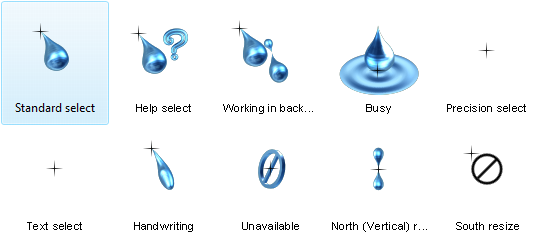
The onboarding experience was surprisingly straightforward. Installation was quick, and upon launching CursorFX, I was greeted with an intuitive interface that immediately presented a gallery of pre-installed cursors. No complex settings menus or obscure configurations to wade through. The first thing I did was browse through the “Apply” section, where I could preview various cursor designs. I chose one that was slightly larger than the default, high-contrast, and had a subtle, shimmering animation. Clicking “Apply” instantly changed my cursor. The immediate difference was palpable. My cursor, no longer a phantom, now had a distinct presence on my screen, even against busy backdrops. The subtle animation wasn’t distracting but served as a visual beacon, drawing my eye to its location without effort. It felt like a weight had been lifted, though I hadn’t realized how heavy it was until it was gone.

Stardock CursorFX review

My first real output with CursorFX wasn’t just applying a pre-made design; it was diving into the customization options. The software allows you to tweak size, color, drop shadow, and even add motion trails and sound effects. I started by taking one of the high-contrast cursors and adjusting its color to a vibrant, but not garish, cyan – a color I rarely use in my design work, ensuring it would stand out against most of my palettes. Then I experimented with a short, subtle motion trail, just enough to make it traceable during fast movements without leaving a distracting streak across the screen. The real surprise came when I discovered the “Create” feature, which allowed me to import my own .PNG files. I took my brand’s logo, cropped it down to a suitable size, and within minutes, I had a custom cursor with my brand mark as the pointer, complete with a gentle glow effect I’d added in the software. This wasn’t just about visibility anymore; it was about professional branding, about making my digital presence feel cohesive. The immediate reaction was pure satisfaction. The cursor was usable immediately, required no heavy editing of the design itself, and felt perfectly integrated. I even set up a specific profile for my live streams – a slightly larger, more animated version of my branded cursor – and tested it out during a quick screen recording. The difference was night and day; my audience could effortlessly follow my mouse movements, and I didn’t once lose track of it.

Now, CursorFX has become an integral part of my daily and weekly workflow. I’ve created several distinct cursor profiles for different tasks. For general design work and client meetings, I use a subtle, branded cursor with a gentle glow that maintains a professional aesthetic while ensuring visibility. When I’m working on intricate pixel-level adjustments in Photoshop, I switch to a smaller, more precise cursor with no animation, which allows me to maintain accuracy without visual distraction. But where it truly shines is during my content creation process. For recording tutorials, demonstrating software features, or live streaming my design sessions, I activate a profile specifically designed for maximum visibility: a slightly larger, high-contrast cursor with a distinct, but not overwhelming, animated trail. This setup has cut down my video editing time significantly. I used to spend an embarrassing amount of time in post-production, adding highlights or annotations to my cursor path because it was so hard to follow during the original recording. Now, with a clearly visible, animated cursor, my audience can track every movement without me having to add artificial indicators. This alone saves me at least 30-45 minutes per tutorial video, which adds up to several hours a week given my content schedule.

What CursorFX does exceptionally well is its blend of ease of use and powerful customization. Applying a new cursor is literally a one-click process, making it incredibly simple to switch between profiles on the fly. The depth of customization, from adjusting basic visual attributes like size and color to adding complex animations and importing custom graphics, means I can tailor my cursor to virtually any professional need or aesthetic preference. The integration with WinCustomize.com, offering thousands of community-created cursors, also provides a fantastic starting point for inspiration or quick solutions. However, it’s not without its quirks. One limitation I’ve found is the lack of an intelligent profile switching mechanism. I wish CursorFX could automatically detect which application is in focus and switch to a pre-assigned cursor profile. For example, when I open Premiere Pro, it would automatically switch to my video editing cursor; when I open OBS for streaming, it would switch to my streaming cursor. As it stands, I have to manually select the profile from the system tray icon, which, while quick, is still an extra step that occasionally breaks my flow. It’s a minor friction point in an otherwise smooth experience. Compared to my old process of constantly losing my cursor, resorting to crude Windows accessibility settings, or fumbling with unreliable freeware, CursorFX offers a level of polish, stability, and professional utility that those methods simply could not provide. The quality difference in my screen recordings is stark, and the time saved in post-production is a tangible benefit that directly impacts my bottom line.

Stardock CursorFX review

There are a few things that have genuinely annoyed me about CursorFX, mostly minor but worth mentioning. As I touched on, the manual profile switching is probably the biggest one. It’s not a deal-breaker, but in an era of increasingly intelligent software, it feels like a missed opportunity for a feature that would elevate the user experience significantly. Another slight annoyance is the sheer volume and varied quality of cursors available on WinCustomize. While having “thousands” sounds great on paper, sifting through them to find truly professional, subtle, or well-designed cursors for a business context can be a time sink. Many are clearly designed for gaming or novelty, which is fine, but it means I often end up creating my own or heavily modifying existing ones rather than finding an immediate, perfect fit. This isn’t a flaw in the software itself, but more a consequence of a large, diverse community.

Despite these minor frustrations, I genuinely feel the pricing for CursorFX is justified for what I get out of it. For a tool that directly contributes to my efficiency, the professionalism of my content, and reduces daily frustration, the cost is a small investment. It’s not an ongoing subscription, which I appreciate; it’s a one-time purchase. The time it saves me in video editing alone, not to mention the improved client perception during screen shares, easily covers its cost many times over within a month. There are still situations where I occasionally find myself doing things the “old way,” or at least a variation of it. For instance, if I’m quickly demonstrating something on a shared screen for a client who is particularly sensitive to visual clutter, I might momentarily switch back to a very subtle, almost default-looking cursor, even if it’s harder for me to track. It’s a compromise I make for specific client preferences, but it highlights that even with the best tools, human interaction and specific situational demands sometimes dictate a deviation from the optimal workflow. I’m always experimenting with new ways to refine my cursor profiles, perhaps creating an even more minimal one for those specific client scenarios, to see if I can truly eliminate the need for the default Windows cursor entirely.

Ready to try it?
See the latest details on the official website.

Visit Official Website

Opens in a new tab.

Additional workflow notes before choosing CursorFX

CursorFX is a niche tool, but it solves a real personalization problem for the right user. The official page frames it around customizing the Windows cursor and creating your own. That sounds small until you think about how often the cursor is part of the workday. On large monitors, multi-monitor setups, demos, recordings, or visually dense desktops, the pointer can either disappear into the interface or become a useful visual anchor.

The best reason to consider CursorFX is not novelty alone. A custom cursor can make a desktop feel more intentional, and in some workflows it can make the pointer easier to follow. That can matter for screen recordings, tutorials, presentations, accessibility preferences, or simply personal taste. The caution is that cursor effects should remain readable. If the design gets too decorative, it can become harder to use than the default pointer.

CursorFX is therefore most appealing to Windows customization fans, creators who record their screens, and users who want every visible part of the desktop to match their style. It is probably not a must-have for someone who only wants productivity gains. If the cursor is one of the details you notice every day, the current CursorFX options are worth checking before you decide.

WindowBlinds Review 2026: Custom Skins & Themes for Windows Desktop

0

For years, my digital workspace felt like a sterile, unchanging office cubicle. I’m a content strategist and designer, which means I spend upwards of ten hours a day staring at screens, toggling between design software, content management systems, analytics dashboards, and communication platforms. The default Windows interface, while functional, always felt like a necessary evil, a bland backdrop to the vibrant, often complex work I was doing. It was a constant source of low-level visual fatigue, a generic aesthetic that often clashed with the creative output I was trying to produce. Every new client project brought with it a unique brand identity, a specific color palette, and a particular visual mood, and yet my operating system remained stubbornly, uniformly blue-grey or stark white.

Before I discovered WindowBlinds, my attempts at personalization were rudimentary at best. I’d cycle through the limited built-in Windows themes, which mostly amounted to changing the wallpaper and a few accent colors. I dabbled with high-contrast themes for a while, hoping to reduce eye strain, but they often made text look jagged and certain application UIs unusable. I even tried a few obscure third-party desktop customization tools I found on various forums. These usually promised radical transformations but delivered either instability, resource hogging, or a frustratingly piecemeal approach where only parts of the UI changed, leaving an incoherent mess. I’d spend hours trying to get a custom icon pack to work across all my folders, only to find the taskbar remained stubbornly default, or a critical system dialog box would pop up in a jarring, un-themed style. It was a constant battle against the default, a battle I was consistently losing, and it ate into time I should have been spending on actual client work.

The breaking point arrived during a particularly demanding period when I was juggling three major client projects simultaneously, each with vastly different visual requirements. One client’s brand was all about vibrant, energetic pastels, another was sleek and minimalist with deep forest greens, and the third was bold and corporate with sharp blues and whites. My screen was a kaleidoscope of these disparate aesthetics, yet the underlying Windows UI remained its default, uninspired self. Switching between applications felt like a visual shock, constantly pulling me out of the immersive brand world I was trying to create and into the generic OS. My eyes felt perpetually strained, and my focus would waver as I tried to mentally filter out the clashing UI elements. I remember one evening, close to midnight, staring at a particularly garish combination of a client’s bright orange design in Adobe Illustrator overlaid on a default Windows dialog box with its stark blue title bar. It was an aesthetic nightmare, and in that moment, I knew I needed a more profound solution than just another wallpaper change. This constant visual dissonance was not just an annoyance; it was genuinely impacting my productivity and mental clarity. I needed a way to make my operating system feel like an extension of my creative process, rather than a barrier to it.

I stumbled upon WindowBlinds during a late-night Google deep dive, specifically searching for “deep Windows UI customization” and “operating system themes beyond basic settings.” I was scrolling through a tech enthusiast forum where someone mentioned Stardock products in passing, and the name “WindowBlinds” caught my eye. I navigated to their website, somewhat skeptically, given my past experiences. The landing page was clean, professional, and showcased various screenshots of radically transformed Windows desktops. It promised to customize the Start menu, taskbar, window frames, and control buttons, which immediately sounded more comprehensive than anything I had tried before. It looked legitimate, not like some amateur freeware site, and the promise of “skins” and “visual styles” suggested a level of depth that went beyond simple color changes. The most reassuring aspect was the mention of a free trial. I figured there was no harm in trying it out; at worst, I’d waste an hour and uninstall it. At best, it could be the solution to my persistent visual fatigue. The frustration of my current setup far outweighed any hesitation I had about trying new software.

The onboarding experience was surprisingly smooth, a welcome change from the often convoluted installations of other customization tools. After a quick download and installation, WindowBlinds presented me with a selection of pre-installed skins. It wasn’t an overwhelming array, but a curated set that immediately showcased the potential for transformation. My first real output was applying a dark, minimalist skin called “Carbonite” and then tweaking its accent color to a deep, calming teal, a shade that often features in my personal branding and creates a sense of focus. The change was immediate and striking. The entire Windows interface, from the Start button to the scroll bars within application windows, adopted this new aesthetic. My honest reaction was a genuine sense of relief, followed by a quiet “finally.” It wasn’t just a superficial layer; it felt like the operating system itself had been re-skinned. The elements that had previously clashed with my work now blended seamlessly, creating a cohesive visual environment. The most surprising detail was how thoroughly it integrated. Even the tiny checkboxes and radio buttons in system dialogs, which usually remained stubbornly default, had adopted the new style. It wasn’t just window borders; it was the entire visual grammar of Windows.

Stardock WindowBlinds review

In my daily workflow, WindowBlinds has become an indispensable tool. It’s one of the first things I install and configure on any new machine or fresh Windows installation. My process usually begins by selecting a base dark skin that offers good contrast and readability, then I delve into the customization options. I adjust the transparency of window frames, choose specific fonts that are easy on the eyes for UI elements, and, most importantly, fine-tune the color palettes. The ability to create and save presets is a genuine time-saver. When I’m deep into a client project, I can load a preset that incorporates their brand’s primary or secondary colors as the system accent color. This subtle visual cue helps me stay immersed in their world, reducing the mental friction of constantly switching between a client’s vibrant brand guidelines and a generic Windows interface. It’s like having a bespoke operating system theme for each major project, which significantly cuts down on the visual context-switching fatigue I used to experience. For instance, when working on the “forest green” client, my entire OS environment shifts to complementary greens and muted grays, creating a consistent visual ecosystem that supports my focus. This is where the WindowBlinds review truly shines; it’s not just about aesthetics, but about creating a more harmonious and productive environment.

What WindowBlinds does exceptionally well is its comprehensive reach. It doesn’t just skin the obvious elements; it delves into the nooks and crannies of the Windows UI, ensuring a consistent look across most system applications and even many third-party programs. The time it saves me isn’t in minutes per task, but in cumulative mental energy. I no longer waste precious focus trying to ignore clashing UI elements or searching for obscure settings to tweak a single visual detail. It creates a calm, predictable visual foundation for all my work. However, it’s not entirely perfect. One area where it occasionally falls short is with extremely niche or legacy applications. Every now and then, I’ll encounter a specific, older piece of software – usually a very specialized analytics tool or a client-specific proprietary program – where a few UI elements might not fully adopt the chosen skin. A button might retain its default Windows 7-era look, or a specific dialog box might pop up un-themed. It’s rare, but it does happen, creating a momentary visual jarring effect that reminds me of the limitations. These instances are minor and infrequent, but they serve as a reminder that no customization tool can account for every single piece of software ever written for Windows.

Compared to my old process of simply tolerating the default Windows look or struggling with unreliable third-party tools, WindowBlinds has made a profound difference in my daily experience. The quality difference is night and day; instead of a patchwork of inconsistent visuals, I have a fully cohesive and aesthetically pleasing environment. In terms of cost, it’s a one-time purchase, which feels incredibly justified for the amount of daily relief and improved focus it provides. I don’t have to factor in “time spent fighting the UI” into my project estimates anymore. It’s not just about making Windows look pretty; it’s about making it a more comfortable and less distracting place to work for extended periods. The visual calm it brings allows me to direct my mental energy towards the actual creative and strategic challenges of my job, rather than expending it on subconscious irritation with my operating system’s appearance.

One thing that genuinely annoyed me for a while was the sheer breadth of available skins on WinCustomize.com, accessible directly from within the app. While it’s fantastic to have so many options, sometimes finding that perfect, stable skin that doesn’t have any minor quirks with my specific setup can be a rabbit hole. I’d spend a good hour or so downloading and testing various community-created skins, only to find a subtle UI element that didn’t quite render correctly in a rarely used program, forcing me to switch again. It’s a minor frustration, more a testament to the vast library than a flaw in the software itself, but it can be a time sink if you let it. The pricing, for what it delivers, feels entirely justified. It’s a professional-grade tool for deep system customization, and the stability and consistency it offers across the entire Windows shell are well worth the investment. It’s not a subscription, which is a big plus for me, as I prefer owning my software.

Stardock WindowBlinds review

Despite its broad capabilities, there are still situations where I have to revert to the “old way” of doing things, at least partially. For example, when running virtual machines for testing purposes, I often keep them in their default Windows aesthetic to ensure I’m seeing a pristine, unskinned environment, just as a typical user would. Or, as mentioned, with those rare, stubborn legacy applications, I just accept that a few of their UI elements will remain unthemed. It’s a small compromise for the overall benefit, and it doesn’t detract from the significant improvements it brings to my primary workspace. The vast majority of my daily interactions with Windows are now visually harmonious and tailored to my preferences, which is a stark contrast to my previous experience. I’m currently exploring the SkinStudio companion application more deeply. I’ve mostly stuck to customizing existing skins, but the idea of designing a truly bespoke skin, perhaps one that subtly integrates my company’s specific brand elements into every corner of the OS, is a project I’m looking forward to tackling next.

Ready to try it?
See the latest details on the official website.

Visit Official Website

Opens in a new tab.

Additional workflow notes before choosing WindowBlinds

WindowBlinds is best judged by how much the look of Windows matters to you. The official positioning is about customizing the look and feel of Windows 10 and Windows 11, including the visual layer around windows and the taskbar. That is not the same problem solved by a launcher, a tab manager, or a file organizer. This is for people who want the operating system itself to feel more personal and less default.

The practical benefit is control. Many Windows users spend years inside the same interface even when they do not particularly like it. A theme layer can make the machine feel more comfortable, more coherent, or simply more fun to use. The risk is going too far. A dramatic skin can look impressive in a screenshot and become tiring in real work. The best WindowBlinds setup is usually one that improves the mood of the desktop while keeping contrast, readability, and window controls easy to understand.

That makes WindowBlinds a strong fit for enthusiasts, creators, and anyone building a distinctive desktop setup. It is less essential for users who never notice interface details or who prefer the default Windows design. Before buying, the smart move is to think about whether you want subtle refinement or a full visual transformation. Then review the current WindowBlinds details and decide whether it belongs in your customization stack.

ObjectDock Review 2026: A macOS-Style Dock for Windows Users

0

My digital life, for the longest time, was a chaotic mess of shortcuts, open windows, and an ever-expanding taskbar. As a freelance digital marketer, I’m constantly juggling multiple clients, each with their unique set of tools, brand assets, campaign reports, and communication channels. One day I’d be knee-deep in SEO analysis for a B2B SaaS client, the next I’d be crafting social media ad copy for an e-commerce brand, and then jumping into video editing for a YouTube content creator. This meant my desktop was a graveyard of half-finished projects, my taskbar overflowed with applications, and my File Explorer frequently had half a dozen windows open simultaneously, each pointing to a different client’s folder. I’d have Photoshop, Premiere Pro, Chrome, Firefox, Slack, Teams, my CRM, an analytics dashboard, and a few client-specific applications all vying for attention. The visual noise alone was exhausting, let alone the mental overhead of trying to remember where I’d last saved that crucial brand guide or the latest performance report.

Before I found a better way, my approach to organization was, frankly, reactive and inefficient. I tried pinning every frequently used application to my Windows taskbar, which quickly became an unmanageable ribbon of indistinguishable icons. Then I tried creating desktop folders, but these just piled up, turning my desktop into a different kind of cluttered wasteland, where icons were nested three layers deep. I relied heavily on the Windows Search bar, typing out application names or file paths, which worked, but it was a constant interruption to my flow. For client-specific files, I often resorted to keeping multiple File Explorer windows open, minimized, or just leaving them piled on top of each other, making it a game of ‘find the right window’ every time I needed something. It was a manual, time-consuming process that chipped away at my productivity, minute by minute, hour by hour. I remember one particularly frantic afternoon when I was trying to pull together a last-minute presentation for a prospective client. I had about 30 minutes before the call, and I couldn’t find the case study I had prepared. It was buried in a folder, within a folder, within a client archive, amidst a sea of other files. That 10-minute search felt like an eternity and cost me valuable prep time, leaving me flustered before a critical meeting. That was my breaking point. I realized that my ad-hoc system, or lack thereof, was not only costing me time but also adding significant stress to my workdays. The mental load of constantly searching, organizing, and then re-searching was becoming unsustainable. I knew there had to be a more elegant solution than just endlessly pinning things or creating more desktop folders.

My discovery of ObjectDock was born out of pure frustration, late one evening after yet another day spent battling digital disorganization. I was searching for “Windows desktop organization tools” and “how to clean up a cluttered taskbar,” looking for anything that promised a more streamlined workflow. I stumbled upon the Stardock website, and what immediately caught my eye was the clean, modern interface and the promise of an “animated dock for Windows.” The product page showcased dynamic, customizable docks that could house applications, files, and shortcuts, making them easily accessible without cluttering the main desktop or taskbar. It felt like exactly what I needed: a visual, intuitive way to manage my digital assets. My first impression of the website was positive; it looked legitimate, well-designed, and clearly articulated the benefits. It didn’t feel like an over-the-top promise, but rather a practical solution to a common problem. The fact that they offered a free 30-day trial was the clincher. I figured I had nothing to lose but a bit of download time. My current frustration level was high enough that I would have probably tried it even without a trial, but the no-commitment option made the decision to dive in almost instantaneous. I downloaded it, hoping it would bring some semblance of order to my increasingly chaotic freelance existence. The idea of an ObjectDock review was far from my mind at that point; I just wanted to solve my problem.

The onboarding experience was surprisingly smooth. Installation was quick, and within minutes, I had my first dock appearing on my screen. It presented a default set of icons, and the real magic began as I started dragging and dropping my most frequently used applications onto it. The immediate visual feedback, the subtle animations as icons settled into place, and the magnification effect when I hovered over them felt incredibly satisfying. My first real task was to consolidate my core marketing toolkit. I created a primary “Quick Launch” dock and filled it with Chrome, my email client, my project management software, Slack, and Photoshop. Then, I tackled the client-specific chaos. This is where the “Tabbed Docks” feature truly shone. I created a tabbed dock for “Client A,” and within it, I dragged shortcuts to their specific brand assets folder, their analytics dashboard bookmark, their social media scheduling tool, and the folder containing their ongoing campaign reports. I repeated this for “Client B” and “Client C.” The ability to neatly tuck away these client-specific resources into organized tabs, accessible with a single click, was a revelation. My honest reaction was a mix of relief and genuine surprise. The desktop, which had been a visual battleground, instantly cleared up. My taskbar, once a sprawling line of icons, suddenly looked almost empty. The functionality was immediately usable; I didn’t need to spend hours configuring or learning complex commands. It felt intuitive, like an extension of how I naturally wanted to organize things. One specific detail that truly surprised me was the depth of customization available for the dock’s appearance. I could change the size of the icons, their transparency, the dock’s background, and even the animation style. This meant I could make it blend seamlessly with my existing desktop wallpaper or stand out prominently, depending on my preference. It wasn’t just functional; it was aesthetically pleasing.

Stardock ObjectDock review

Now, ObjectDock is an indispensable part of my daily workflow. My main Windows taskbar is almost barren, usually only housing File Explorer, Outlook, and occasionally Teams if I’m in a heavy meeting day. All my essential applications and client-specific resources live in various docks. My primary quick-launch dock, typically positioned at the bottom or side of my main monitor, holds my core applications – my web browsers, video editing software, image manipulation tools, and my main CRM. Beyond that, I leverage multiple tabbed docks, each dedicated to a different aspect of my work. I have a “Current Clients” dock with tabs for each active client, containing direct links to their project folders, specific web applications, and communication channels. Another dock is dedicated to “Content Creation Tools,” housing shortcuts to my various AI writing assistants, stock photo libraries, and graphic design software. I even have a “Personal Projects” dock for my side hustles and learning resources. This setup allows me to switch contexts with incredible speed and efficiency. If I need to jump from drafting an email for Client A to reviewing analytics for Client B, it’s literally two clicks – one to open the “Current Clients” dock, and another to select the appropriate tab. This significantly reduces the mental friction of switching gears. I often use the “hide when not in use” feature for client-specific docks, so they only pop up when I hover my mouse over their designated area, keeping my screen perfectly clean and distraction-free when I’m focused on a single task.

The area where ObjectDock truly excels is providing rapid, visual access to frequently used applications and files, especially when you need to categorize and switch between different sets of tools depending on the task at hand. It has significantly cut down my “finding a file or launching an application” time. What used to be a minute or two of navigating folders or typing into the search bar has become a swift, almost instantaneous click. For instance, when I’m about to start a social media campaign for a client, I used to open my social media scheduler, then a separate tab for their brand guidelines, then navigate to their image assets folder, then open my content calendar spreadsheet. Now, all those resources are grouped under a single tab within my “Client X” dock. It’s a single click to open the dock, another click on the tab, and then I can launch all four items in rapid succession. This efficiency gain isn’t just about saving seconds; it’s about maintaining focus and reducing the cognitive load that comes with constant searching. I would estimate it saves me at least 30-45 minutes every day, simply by making my digital workspace more organized and accessible. This might not sound like much, but over a week, it’s several hours, and over a month, it’s almost a full workday saved. My old process was a constant battle against digital entropy, a never-ending cycle of opening, closing, and re-opening windows. Now, my desktop is clean, my taskbar is minimal, and my workflow feels like a well-oiled machine.

However, it’s not a complete panacea, and there are areas where it doesn’t quite replace traditional file management. While it’s fantastic for launching specific shortcuts, it’s not designed to be a full-fledged file browser. If I need to delve deep into a complex folder structure, perhaps searching for a specific historical document that isn’t a frequently accessed shortcut, I still open File Explorer. It’s also important to note that while the customization options are extensive, getting the exact visual style and behavior you want can take a bit of experimentation. The sheer number of options for icon size, effects, transparency, and dock positioning, while powerful, can be a little overwhelming initially. There’s a slight learning curve to mastering all the visual nuances and behaviors, especially if you want to create a truly bespoke setup. For example, getting the “always on top” versus “hide when using other applications” behavior perfectly tuned for each dock took a bit of trial and error. Sometimes, if I load a tabbed dock with an excessive number of icons, the scrolling behavior can feel a tiny bit sluggish, though this is a rare occurrence as I try to keep my docks focused. Despite these minor points, the improvement over my old, haphazard system is monumental. The quality of my work has indirectly improved because I spend less time on administrative tasks and more time on creative and strategic thinking. My old process was akin to working at a perpetually messy desk; now, it feels like I have a perfectly organized, custom-built workspace.

Stardock ObjectDock review

One thing that genuinely annoyed me for a brief period was after a major Windows feature update. For some reason, my primary dock’s position shifted slightly, and a few of my custom transparency settings reverted to default. It wasn’t a catastrophic issue, but it required about five minutes of readjustment to get it back to my preferred setup. It doesn’t happen often, perhaps once every six months with a significant OS update, but it’s a minor frustration when it does. I also sometimes wish there were a few more “subtle” or “professional” animation styles beyond some of the more playful, bouncy effects. While I’ve found settings that work for me, the default animations lean a bit more towards aesthetic flair than pure functional minimalism. However, these are truly minor quibbles in the grand scheme of things.

Considering the significant time savings, the reduction in daily frustration, and the overall improvement in my digital workspace’s efficiency and aesthetics, the pricing for ObjectDock feels completely justified. It’s a relatively small investment for a tool that fundamentally changes how I interact with my computer on a daily basis. For a freelancer like me, where time literally translates to billable hours, the return on investment is almost immediate. It’s part of a larger suite of tools Stardock offers, but even as a standalone product, it holds its own. Despite its utility, there are still situations where I find myself reverting to old habits. For instance, if I’m searching for a very specific, obscure file that I know is buried deep within a client’s archived project from two years ago, I won’t rely on ObjectDock. I’ll still open File Explorer and use its robust search capabilities to comb through nested folders. ObjectDock is for frequent access, for the 90% of my daily interactions. The remaining 10% still falls to the traditional Windows search and file system. It’s not a complete replacement for every aspect of Windows navigation, nor does it claim to be, but it handles the vast majority of my immediate access needs with elegance and speed. I’m currently experimenting with creating a dedicated dock for my personal development resources – things like programming guides, online course links, and e-books – to keep that learning separate and easily accessible, without it bleeding into my client-focused workspace. It’s another small step towards an even more streamlined and focused digital environment.

Ready to try it?
See the latest details on the official website.

Visit Official Website

Opens in a new tab.

DeskScapes Review 2026: Animated Wallpapers & Live Desktop Customization

0

My workspace is entirely digital, and for years, my desktop, the very canvas where all my work unfolds, felt like a beautifully designed but ultimately static billboard. As a freelance digital content strategist, I spend upwards of twelve hours a day staring at my monitor. My desktop background, whether a serene landscape or a bustling city at night, was a constant, unchanging presence. While initially pleasing, these static images would, over time, fade into the background, becoming visual white noise. The problem wasn’t just aesthetic; it was about the subtle, creeping sense of stagnation that a fixed backdrop can introduce into a dynamic, creative workflow. I’d often find myself mentally adrift during a particularly challenging writing block or a repetitive task, my gaze drifting to the wallpaper, only to find the same unchanging scene. It offered no new input, no fresh spark to re-engage my focus or creativity.

I tried everything to combat this visual monotony. I had folders brimming with hundreds of high-resolution images, painstakingly curated from various photography sites. I’d set Windows to cycle through them every hour, but even with a vast collection, the changes felt abrupt and lacked cohesion. Then I ventured into the world of animated wallpapers, hoping for a more fluid experience. This quickly became a frustrating exercise in compromise. Free animated backgrounds were often low-resolution, pixelated, or came from dubious sources. High-quality ones were scarce, often resource-intensive, or required specialized players that felt clunky and intrusive. I experimented with various lightweight video loop players, trying to turn short cinematic clips into backgrounds, but they invariably ate up CPU cycles, made my fans spin up, or introduced subtle stutters that were more distracting than the static images they replaced. The breaking point arrived during a particularly demanding campaign launch, where I was juggling multiple client deadlines, brainstorming sessions, and content creation. My energy levels were plummeting, and my desktop, usually a source of calm, felt like a stagnant pool, reflecting my own creative exhaustion. I needed something that could offer dynamic visual stimulation without becoming a drain on my system or my time. I needed a living canvas, not just a painted wall.

The search for a better solution was born out of that frustration. I remember late one evening, after another fruitless hunt for a decent animated background, I stumbled upon a mention of Stardock products in a subreddit dedicated to PC customization. Someone was raving about their tools for transforming the Windows experience. I ended up on the Stardock website, and specifically, the page for DeskScapes. My first impression was one of cautious optimism. The website looked professional, clean, and didn’t bombard me with over-the-top promises. It clearly articulated its purpose: animating and customizing desktop wallpapers, including support for video and generated content. What truly piqued my interest was the mention of local image generation and AI restyling, all without needing tokens or cloud processing. This sounded like exactly what I needed – creative control without the usual overheads. The clincher was the 30-day free trial. With nothing to lose, and everything to gain in terms of a more inspiring workspace, I decided to give it a shot, driven purely by the hope of finally solving my desktop dilemma. This DeskScapes review would be an honest reflection of that trial.

The onboarding experience was surprisingly smooth. Downloading and installing DeskScapes was quick, taking only a few minutes. The application’s user interface, which matches the aesthetic of Windows 11, felt immediately familiar and intuitive. I appreciated the clean layout, with clear categories for static, animated, and generated backgrounds, along with options for effects and playlists. There wasn’t a steep learning curve; I could jump right in without needing to consult a manual or watch a tutorial. My first real output involved diving straight into the local image generation feature. I typed in a prompt, something like “serene forest path with dappled sunlight and a gentle mist,” hoping for something that could evoke calm during intense work periods. The generation process, leveraging my GPU, was remarkably fast. Within moments, I had a unique image. It wasn’t perfect on the first try, needing a few iterations to get the composition just right, but the quality was impressive for an on-device generation.

My honest reaction was a mix of surprise and genuine delight. The image itself was beautiful, but the true magic happened when I started applying effects. I added a subtle “slow pan” animation, a gentle “ripple” to simulate a breeze, and a touch of “soft focus.” Suddenly, my static image was transformed into a living, breathing scene. It was usable immediately, requiring minimal editing beyond my initial prompt refinements and effect choices. The most surprising detail was the “AI Restyle” feature. I took a high-resolution photo I’d captured during a hike – a simple mountain vista – and applied an “oil painting” style to it. The transformation was instant and stunning. It didn’t just slap a filter on it; it genuinely reinterpreted the image in a painterly style, making it feel entirely new and artistic. This capability alone felt like unlocking a whole new dimension of desktop personalization, turning my personal photos into gallery-worthy backgrounds that moved and breathed.

Stardock DeskScapes review

In my daily workflow now, DeskScapes has become an indispensable tool. I no longer waste time endlessly searching for new wallpapers or wrestling with temperamental video players. My primary use case revolves around its playlist feature. I’ve created several themed playlists: one for deep focus with calm, subtly animated abstract art or nature scenes; another for brainstorming with more dynamic, energetic sci-fi or cyberpunk visuals; and a general one that cycles through my favorite AI-generated creations and restyled personal photos. I’ve configured them to change every 30 minutes, providing a constant, fresh visual input that subtly shifts my mental state without being distracting. It’s like having a dynamic mood board constantly evolving in the background.

What DeskScapes does exceptionally well is animating static images and providing robust local AI generation. This saves me significant time – easily an hour or two a week that I used to spend searching, downloading, and troubleshooting. Instead of a manual hunt, I can now generate a unique background tailored to my exact needs in minutes, or take an existing image and breathe new life into it with effects. The ability to upscale images to 4K locally is also a huge benefit, ensuring everything looks crisp on my high-resolution monitor. My old process involved a lot of compromise on quality or performance, but with DeskScapes, the quality difference is night and day, and it runs efficiently without noticeable impact on my system resources, even with multiple monitors.

However, DeskScapes is not without its limitations. While the AI generation is powerful, it sometimes produces results that are a bit too generic or don’t quite capture the specific nuance I’m aiming for without very precise and iterative prompting. It’s not a magic bullet that reads my mind; there’s still an art to crafting effective prompts, and occasionally, I find myself generating four or five variations before I get something I’m truly happy with. Another quirk is the sheer number of effects available. While extensive, it can be a bit overwhelming to navigate and combine them effectively to achieve a specific look. There’s a learning curve in understanding how different effects interact and which combinations yield the most pleasing results. Sometimes, I still have to do a bit of manual tweaking in an external image editor if I want a very specific color correction or a complex composite that the AI generation isn’t quite ready to handle on its own.

Stardock DeskScapes review

One thing that genuinely annoyed me initially was the process of migrating my existing collection of static wallpapers into the DeskScapes ecosystem. While the application is excellent at organizing new creations and existing ones once imported, the initial import process for hundreds of images felt a bit cumbersome, requiring me to point it to specific folders and then manually categorize them if I wanted to use them in different playlists. It wasn’t a deal-breaker, but it was a minor friction point during the setup phase. Regarding pricing, I opted for the perpetual license, which for me, feels entirely justified. Considering the amount of time it saves me, the creative inspiration it provides, and the fact that it’s a one-time purchase for ongoing functionality, it’s a solid investment in my digital workspace. The alternative, a 1-year subscription as part of Object Desktop, also seems like a good value for those who want a suite of enhancement tools. I also appreciate that the local AI generation means no hidden costs or “token” purchases down the line, which is a common frustration with many cloud-based AI tools.

Despite its capabilities, there are still situations where I revert to my old ways. For instance, if a client project demands a very specific, photorealistic background for a presentation slide – say, a precise architectural shot of a building – I’ll still go to a stock photo site. While DeskScapes can generate stunning images, its strength lies in artistic interpretation and animation rather than replicating specific real-world scenes with absolute photographic accuracy. It’s a tool for creative enhancement and dynamic personalization, not a replacement for professional photography or highly specific visual assets. My workflow has been optimized, but not entirely revolutionized in every single niche.

I’m still exploring the full depth of the effects library, experimenting with combining more complex layers to create truly unique, evolving backdrops. I’m also looking forward to using it more for themed client work, generating custom animated backgrounds that subtly reflect the brand or campaign I’m working on, to keep my own visual environment aligned with the project. It’s become more than just a wallpaper changer; it’s a dynamic element of my professional identity, a quiet, constantly evolving source of visual interest that keeps my digital workspace feeling fresh and inspiring.

Ready to try it?
See the latest details on the official website.

Visit Official Website

Opens in a new tab.

Additional workflow notes before choosing DeskScapes

DeskScapes is a different kind of utility from the more productivity-heavy Stardock tools. Its value is emotional and environmental first. The official product positioning centers on personalizing the desktop background with generated wallpapers, animations, and video. That matters most for people who spend a long time at a Windows desk and want the machine to feel less generic. It will not organize files, speed up typing, or replace a task manager. It changes the surface you stare at all day.

That sounds cosmetic, but cosmetics can still affect how a workspace feels. A static wallpaper is easy to ignore. A more intentional desktop background can make a work machine feel like a designed environment rather than a default install. The key is moderation. Animated or video backgrounds should support the mood of the desk, not compete with the work. If a background is too bright, too busy, or too distracting, it stops being personalization and starts being visual noise.

The best fit is someone who enjoys customizing Windows and wants more than a simple image swap. Designers, creators, streamers, home office users, and Windows enthusiasts are more likely to appreciate it than someone who keeps every app maximized all day. It is also a better fit if you like refreshing your setup regularly. If you change your desktop once every five years, the feature set may be more than you need.

For buyers comparing Stardock tools, DeskScapes is not the first choice for pure productivity. It is the choice for making a PC feel personal. If that is the missing piece in your setup, check the current DeskScapes options and confirm which version and features match how you want your desktop to look.

One final buying note: DeskScapes is most worthwhile when you want your desktop to feel intentionally designed, not merely decorated. If that visual refresh makes the workspace more pleasant every day, the tool earns its place.

Groupy Review 2026: Tab Your Windows Like a Browser for Better Productivity

0

For years, my digital workspace was a battleground. As a freelance content strategist, I juggle multiple clients, each with their own brand guidelines, research materials, content calendars, and communication channels. My daily routine involved a dizzying dance between browser tabs, Word documents, project management software, image editors, and various communication apps. It wasn’t just a matter of having many windows open; it was the constant context switching, the endless Alt-Tabbing, and the frustrating search for that one specific window I needed right now. I’d often find myself with thirty or forty browser tabs open across two or three browser windows, a couple of Word documents, a PDF reference, a Slack window, and a Trello board, all scattered across my two monitors. The sheer visual noise was draining, and the mental overhead of remembering where everything was, or trying to logically arrange them, became a significant bottleneck in my productivity. I was spending valuable minutes every hour just wrangling windows, not actually creating.

I tried everything to bring order to the chaos. Virtual desktops became a temporary reprieve, allowing me to separate client A’s work from client B’s, but even within a single virtual desktop, the proliferation of individual application windows persisted. I’d stack them manually, resizing and overlapping, attempting to create some semblance of a structured workspace, only to have it dissolve the moment I needed to open a new reference or respond to an urgent message. I even experimented with tiling window managers, but they felt too rigid, too much like I was forcing my workflow into a predefined box rather than adapting to my dynamic needs. My breaking point came during a particularly intense week where I had three major content pieces due simultaneously, each requiring extensive research, writing, and stakeholder feedback. I found myself losing track of which browser window belonged to which project, accidentally closing the wrong document, and generally feeling like I was drowning in a sea of digital rectangles. That week, I probably lost an entire day’s worth of productive time just trying to keep my digital ducks in a row. Something had to give.

I remember it was late, probably past midnight, and I was still trying to untangle my desktop after a particularly brutal day. My frustration boiled over, and I started searching online for “better Windows window management,” “tabbed applications for Windows,” or “organize open programs.” I scrolled through forums, tech blogs, and Reddit threads, desperate for a solution beyond what Windows natively offered. That’s when I stumbled upon Stardock’s website, showcasing Groupy. My first impression was a mix of skepticism and hope. The concept of adding tabs to any application window seemed almost too good to be true, given my previous struggles. The landing page was clean, professional, and had clear animated GIFs demonstrating the core functionality – dragging one window onto another to create a tabbed group. It looked legitimate, not like some flimsy shareware, and the promise of effortlessly organized apps resonated deeply with my current pain. The existence of a free 30-day trial sealed the deal; there was no risk in giving it a shot. I downloaded it right then and there.

The onboarding experience was surprisingly smooth. After a quick installation, Groupy integrated itself into my system without a hitch. There wasn’t a complex setup wizard or a lengthy configuration process. It just worked. The moment I dragged my Chrome browser window onto a Word document, a new tab appeared on the Word window’s title bar, showing the Chrome icon. It was a small visual cue, but it instantly clicked. This wasn’t just a visual trick; it was a fundamental change in how I could interact with my open applications. My first real test was to create a workspace for a new client project. I opened a new instance of my web browser for research, a fresh Word document for drafting, and a specific folder in File Explorer where I kept client assets. One by one, I dragged the File Explorer onto the Word document, then the browser onto that combined group. Suddenly, I had a single, tabbed window housing all the core applications for that project.

Stardock Groupy 2 review

My honest reaction was one of immediate, profound relief. It wasn’t just usable; it was transformative. The ability to switch between my research, my writing, and my file management with a single click on a tab, rather than hunting through the taskbar or cycling with Alt-Tab, felt like a superpower. It immediately reduced the visual clutter and, more importantly, the mental clutter. I could focus on the task at hand, knowing all related resources were consolidated and easily accessible. A specific detail that surprised me was how seamlessly it handled different application types. I expected some compatibility issues, especially with older or less common software, but Groupy just embraced them all. Even my somewhat quirky image editing tool, which sometimes behaved oddly with other window managers, happily became a tab within a group. It felt like Windows itself had finally gained a feature I’d been craving for years. The initial setup for each group was entirely manual, but the immediate payoff was so evident that it felt like a worthwhile investment of a few seconds.

Now, Groupy is an indispensable part of my daily workflow. I have established several “master groups” that I launch almost automatically. For instance, my “Client A” group consists of a specific browser profile (with client-specific bookmarks), their project management tool (usually a web app), and a dedicated note-taking application. My “Content Creation” group often combines a browser for research, a document editor, and a thesaurus application. When I switch between projects, I simply minimize one group and maximize another. This significantly cuts down on context switching overhead. Instead of closing and reopening applications, or trying to find them amongst dozens of icons, I just switch tabs or switch groups. It’s like having multiple virtual desktops, but each desktop is a single, consolidated application window.

What Groupy does exceptionally well is consolidate all the disparate elements of a single task or project into one manageable window. For content strategy, this means I can group my competitor analysis browser tabs, my keyword research spreadsheet, and my content outline document into a single, tabbed interface. This saves me significant time – easily 30-45 minutes per day – that I used to spend searching, resizing, and reorganizing windows. Before Groupy, a typical research session for a new article would involve opening 10-15 browser tabs, then a Word document, then perhaps a Google Sheet for data, and then trying to keep them all visible or quickly accessible. Now, all those browser tabs are within one Groupy tab, the Word document is another, and the Google Sheet (opened in a dedicated browser instance) is a third. The focus it provides is invaluable.

However, Groupy is not without its minor quirks. While it generally handles automatic grouping beautifully (e.g., all instances of Chrome or File Explorer can be set to automatically group), sometimes specific applications, particularly those with custom window frames or older UI toolkits, don’t always snap into a group as cleanly. The tab might appear slightly misaligned, or the drag-and-drop might require a second attempt. It’s not a deal-breaker, but it reminds you that it’s an overlay, not a native operating system feature. Another minor point is that while it saves time in switching, the initial act of creating a group for a new, transient task still requires manual dragging. While it’s quick, there’s a slight mental overhead in deciding what to group and how. It doesn’t magically predict your grouping needs, which, of course, is an unreasonable expectation for any software.

Stardock Groupy 2 review

Compared to my old process of endlessly juggling individual windows, the difference is night and day. My desktop is cleaner, my mental state is calmer, and I feel more in control of my digital environment. The time saved isn’t just about clicks; it’s about reducing decision fatigue and maintaining focus. Before, I’d often open an application, get distracted by another window peeking out from behind it, and lose my train of thought. Now, when I’m in my “Client B” group, I see only the applications relevant to Client B. This enhanced focus directly translates into higher quality work and fewer errors. The cost of Groupy feels entirely justified for the productivity gains it delivers. It’s a small investment for such a significant improvement in daily workflow, especially for someone like me who lives in front of a computer screen.

There’s one thing that still occasionally gets under my skin. Sometimes, when I’m working on a highly visual task, like editing an image or creating a presentation, I still prefer to have windows side-by-side, completely un-tabbed, to maximize screen real estate for direct comparison. Groupy, by its very nature, wants to consolidate. While you can easily ungroup windows, the default inclination is to tab everything. So, for those specific tasks where I need a very precise, untabbed, side-by-side view of two applications, I still find myself temporarily disabling Groupy or simply avoiding grouping those particular windows. It’s a minor friction point, a subtle push against its core philosophy, but it’s there. It’s not a flaw, just a preference that occasionally clashes with its design.

The pricing for Groupy, especially as a standalone product, feels incredibly reasonable for the value it provides. I also know it’s part of Stardock’s Object Desktop suite, which offers a whole host of other enhancements, but for my specific problem, Groupy alone was the answer. I’ve certainly paid more for software that delivered far less impact on my daily efficiency. There was a time when I considered investing in larger, more complex project management systems, thinking that a top-down solution would tame my window chaos. But those systems often introduced their own learning curves and rigidities, and none of them addressed the fundamental issue of how applications presented themselves on my desktop. Groupy solved a very specific, yet pervasive, problem without forcing me to overhaul my entire work methodology. It simply enhanced the way I already worked.

I’m still refining my grouping strategies, especially for those highly dynamic projects that pop up unexpectedly. I’ve started experimenting with the accent coloring feature to visually differentiate groups, which helps immensely when I have several similar-looking browser tabs open across different projects. It’s a small detail, but it adds another layer of organization to an already powerful tool. My next goal is to leverage its ability to launch predetermined groups from the taskbar more consistently. I can see that saving even more time, transforming my scattered applications into instantly available, focused workspaces with a single click.

Ready to try it?
See the latest details on the official website.

Visit Official Website

Opens in a new tab.

Additional workflow notes before choosing Groupy 2

Groupy 2 is easiest to understand if you think about browser tabs. Most people accept tabs in a browser because related pages should stay together. The same logic applies to Windows apps, but Windows itself does not always keep related work grouped in a way that matches the task. A proposal may involve a document, a spreadsheet, a folder, a browser window, and a notes app. Without a grouping layer, those pieces scatter across the taskbar and Alt-Tab list.

The value of Groupy is not that every app suddenly needs tabs. Some apps are better left alone. The value appears when you can group a repeatable workflow and return to it without rebuilding the context. That makes it useful for research, client work, content planning, finance admin, coding support tasks, and any job where the same cluster of windows keeps coming back. The tool is less compelling for users who live almost entirely inside one browser or one full-screen application.

The buying caution is that tabbed workflows require taste. If you group everything, the tabs become another mess. If you group by project or recurring task, the interface can feel calmer. That is the difference between using Groupy as a dumping ground and using it as a workspace organizer. For people who constantly lose the right window at the wrong time, the current Groupy 2 details are worth reviewing before deciding whether it fits your Windows habits.