


For years, my digital workspace felt like a sterile, unchanging office cubicle. I’m a content strategist and designer, which means I spend upwards of ten hours a day staring at screens, toggling between design software, content management systems, analytics dashboards, and communication platforms. The default Windows interface, while functional, always felt like a necessary evil, a bland backdrop to the vibrant, often complex work I was doing. It was a constant source of low-level visual fatigue, a generic aesthetic that often clashed with the creative output I was trying to produce. Every new client project brought with it a unique brand identity, a specific color palette, and a particular visual mood, and yet my operating system remained stubbornly, uniformly blue-grey or stark white.
Before I discovered WindowBlinds, my attempts at personalization were rudimentary at best. I’d cycle through the limited built-in Windows themes, which mostly amounted to changing the wallpaper and a few accent colors. I dabbled with high-contrast themes for a while, hoping to reduce eye strain, but they often made text look jagged and certain application UIs unusable. I even tried a few obscure third-party desktop customization tools I found on various forums. These usually promised radical transformations but delivered either instability, resource hogging, or a frustratingly piecemeal approach where only parts of the UI changed, leaving an incoherent mess. I’d spend hours trying to get a custom icon pack to work across all my folders, only to find the taskbar remained stubbornly default, or a critical system dialog box would pop up in a jarring, un-themed style. It was a constant battle against the default, a battle I was consistently losing, and it ate into time I should have been spending on actual client work.
The breaking point arrived during a particularly demanding period when I was juggling three major client projects simultaneously, each with vastly different visual requirements. One client’s brand was all about vibrant, energetic pastels, another was sleek and minimalist with deep forest greens, and the third was bold and corporate with sharp blues and whites. My screen was a kaleidoscope of these disparate aesthetics, yet the underlying Windows UI remained its default, uninspired self. Switching between applications felt like a visual shock, constantly pulling me out of the immersive brand world I was trying to create and into the generic OS. My eyes felt perpetually strained, and my focus would waver as I tried to mentally filter out the clashing UI elements. I remember one evening, close to midnight, staring at a particularly garish combination of a client’s bright orange design in Adobe Illustrator overlaid on a default Windows dialog box with its stark blue title bar. It was an aesthetic nightmare, and in that moment, I knew I needed a more profound solution than just another wallpaper change. This constant visual dissonance was not just an annoyance; it was genuinely impacting my productivity and mental clarity. I needed a way to make my operating system feel like an extension of my creative process, rather than a barrier to it.
I stumbled upon WindowBlinds during a late-night Google deep dive, specifically searching for “deep Windows UI customization” and “operating system themes beyond basic settings.” I was scrolling through a tech enthusiast forum where someone mentioned Stardock products in passing, and the name “WindowBlinds” caught my eye. I navigated to their website, somewhat skeptically, given my past experiences. The landing page was clean, professional, and showcased various screenshots of radically transformed Windows desktops. It promised to customize the Start menu, taskbar, window frames, and control buttons, which immediately sounded more comprehensive than anything I had tried before. It looked legitimate, not like some amateur freeware site, and the promise of “skins” and “visual styles” suggested a level of depth that went beyond simple color changes. The most reassuring aspect was the mention of a free trial. I figured there was no harm in trying it out; at worst, I’d waste an hour and uninstall it. At best, it could be the solution to my persistent visual fatigue. The frustration of my current setup far outweighed any hesitation I had about trying new software.
The onboarding experience was surprisingly smooth, a welcome change from the often convoluted installations of other customization tools. After a quick download and installation, WindowBlinds presented me with a selection of pre-installed skins. It wasn’t an overwhelming array, but a curated set that immediately showcased the potential for transformation. My first real output was applying a dark, minimalist skin called “Carbonite” and then tweaking its accent color to a deep, calming teal, a shade that often features in my personal branding and creates a sense of focus. The change was immediate and striking. The entire Windows interface, from the Start button to the scroll bars within application windows, adopted this new aesthetic. My honest reaction was a genuine sense of relief, followed by a quiet “finally.” It wasn’t just a superficial layer; it felt like the operating system itself had been re-skinned. The elements that had previously clashed with my work now blended seamlessly, creating a cohesive visual environment. The most surprising detail was how thoroughly it integrated. Even the tiny checkboxes and radio buttons in system dialogs, which usually remained stubbornly default, had adopted the new style. It wasn’t just window borders; it was the entire visual grammar of Windows.
In my daily workflow, WindowBlinds has become an indispensable tool. It’s one of the first things I install and configure on any new machine or fresh Windows installation. My process usually begins by selecting a base dark skin that offers good contrast and readability, then I delve into the customization options. I adjust the transparency of window frames, choose specific fonts that are easy on the eyes for UI elements, and, most importantly, fine-tune the color palettes. The ability to create and save presets is a genuine time-saver. When I’m deep into a client project, I can load a preset that incorporates their brand’s primary or secondary colors as the system accent color. This subtle visual cue helps me stay immersed in their world, reducing the mental friction of constantly switching between a client’s vibrant brand guidelines and a generic Windows interface. It’s like having a bespoke operating system theme for each major project, which significantly cuts down on the visual context-switching fatigue I used to experience. For instance, when working on the “forest green” client, my entire OS environment shifts to complementary greens and muted grays, creating a consistent visual ecosystem that supports my focus. This is where the WindowBlinds review truly shines; it’s not just about aesthetics, but about creating a more harmonious and productive environment.
What WindowBlinds does exceptionally well is its comprehensive reach. It doesn’t just skin the obvious elements; it delves into the nooks and crannies of the Windows UI, ensuring a consistent look across most system applications and even many third-party programs. The time it saves me isn’t in minutes per task, but in cumulative mental energy. I no longer waste precious focus trying to ignore clashing UI elements or searching for obscure settings to tweak a single visual detail. It creates a calm, predictable visual foundation for all my work. However, it’s not entirely perfect. One area where it occasionally falls short is with extremely niche or legacy applications. Every now and then, I’ll encounter a specific, older piece of software – usually a very specialized analytics tool or a client-specific proprietary program – where a few UI elements might not fully adopt the chosen skin. A button might retain its default Windows 7-era look, or a specific dialog box might pop up un-themed. It’s rare, but it does happen, creating a momentary visual jarring effect that reminds me of the limitations. These instances are minor and infrequent, but they serve as a reminder that no customization tool can account for every single piece of software ever written for Windows.
Compared to my old process of simply tolerating the default Windows look or struggling with unreliable third-party tools, WindowBlinds has made a profound difference in my daily experience. The quality difference is night and day; instead of a patchwork of inconsistent visuals, I have a fully cohesive and aesthetically pleasing environment. In terms of cost, it’s a one-time purchase, which feels incredibly justified for the amount of daily relief and improved focus it provides. I don’t have to factor in “time spent fighting the UI” into my project estimates anymore. It’s not just about making Windows look pretty; it’s about making it a more comfortable and less distracting place to work for extended periods. The visual calm it brings allows me to direct my mental energy towards the actual creative and strategic challenges of my job, rather than expending it on subconscious irritation with my operating system’s appearance.
One thing that genuinely annoyed me for a while was the sheer breadth of available skins on WinCustomize.com, accessible directly from within the app. While it’s fantastic to have so many options, sometimes finding that perfect, stable skin that doesn’t have any minor quirks with my specific setup can be a rabbit hole. I’d spend a good hour or so downloading and testing various community-created skins, only to find a subtle UI element that didn’t quite render correctly in a rarely used program, forcing me to switch again. It’s a minor frustration, more a testament to the vast library than a flaw in the software itself, but it can be a time sink if you let it. The pricing, for what it delivers, feels entirely justified. It’s a professional-grade tool for deep system customization, and the stability and consistency it offers across the entire Windows shell are well worth the investment. It’s not a subscription, which is a big plus for me, as I prefer owning my software.

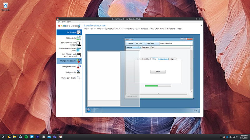
Despite its broad capabilities, there are still situations where I have to revert to the “old way” of doing things, at least partially. For example, when running virtual machines for testing purposes, I often keep them in their default Windows aesthetic to ensure I’m seeing a pristine, unskinned environment, just as a typical user would. Or, as mentioned, with those rare, stubborn legacy applications, I just accept that a few of their UI elements will remain unthemed. It’s a small compromise for the overall benefit, and it doesn’t detract from the significant improvements it brings to my primary workspace. The vast majority of my daily interactions with Windows are now visually harmonious and tailored to my preferences, which is a stark contrast to my previous experience. I’m currently exploring the SkinStudio companion application more deeply. I’ve mostly stuck to customizing existing skins, but the idea of designing a truly bespoke skin, perhaps one that subtly integrates my company’s specific brand elements into every corner of the OS, is a project I’m looking forward to tackling next.
Additional workflow notes before choosing WindowBlinds
WindowBlinds is best judged by how much the look of Windows matters to you. The official positioning is about customizing the look and feel of Windows 10 and Windows 11, including the visual layer around windows and the taskbar. That is not the same problem solved by a launcher, a tab manager, or a file organizer. This is for people who want the operating system itself to feel more personal and less default.
The practical benefit is control. Many Windows users spend years inside the same interface even when they do not particularly like it. A theme layer can make the machine feel more comfortable, more coherent, or simply more fun to use. The risk is going too far. A dramatic skin can look impressive in a screenshot and become tiring in real work. The best WindowBlinds setup is usually one that improves the mood of the desktop while keeping contrast, readability, and window controls easy to understand.
That makes WindowBlinds a strong fit for enthusiasts, creators, and anyone building a distinctive desktop setup. It is less essential for users who never notice interface details or who prefer the default Windows design. Before buying, the smart move is to think about whether you want subtle refinement or a full visual transformation. Then review the current WindowBlinds details and decide whether it belongs in your customization stack.
