


My digital life, for the longest time, was a chaotic mess of shortcuts, open windows, and an ever-expanding taskbar. As a freelance digital marketer, I’m constantly juggling multiple clients, each with their unique set of tools, brand assets, campaign reports, and communication channels. One day I’d be knee-deep in SEO analysis for a B2B SaaS client, the next I’d be crafting social media ad copy for an e-commerce brand, and then jumping into video editing for a YouTube content creator. This meant my desktop was a graveyard of half-finished projects, my taskbar overflowed with applications, and my File Explorer frequently had half a dozen windows open simultaneously, each pointing to a different client’s folder. I’d have Photoshop, Premiere Pro, Chrome, Firefox, Slack, Teams, my CRM, an analytics dashboard, and a few client-specific applications all vying for attention. The visual noise alone was exhausting, let alone the mental overhead of trying to remember where I’d last saved that crucial brand guide or the latest performance report.
Before I found a better way, my approach to organization was, frankly, reactive and inefficient. I tried pinning every frequently used application to my Windows taskbar, which quickly became an unmanageable ribbon of indistinguishable icons. Then I tried creating desktop folders, but these just piled up, turning my desktop into a different kind of cluttered wasteland, where icons were nested three layers deep. I relied heavily on the Windows Search bar, typing out application names or file paths, which worked, but it was a constant interruption to my flow. For client-specific files, I often resorted to keeping multiple File Explorer windows open, minimized, or just leaving them piled on top of each other, making it a game of ‘find the right window’ every time I needed something. It was a manual, time-consuming process that chipped away at my productivity, minute by minute, hour by hour. I remember one particularly frantic afternoon when I was trying to pull together a last-minute presentation for a prospective client. I had about 30 minutes before the call, and I couldn’t find the case study I had prepared. It was buried in a folder, within a folder, within a client archive, amidst a sea of other files. That 10-minute search felt like an eternity and cost me valuable prep time, leaving me flustered before a critical meeting. That was my breaking point. I realized that my ad-hoc system, or lack thereof, was not only costing me time but also adding significant stress to my workdays. The mental load of constantly searching, organizing, and then re-searching was becoming unsustainable. I knew there had to be a more elegant solution than just endlessly pinning things or creating more desktop folders.
My discovery of ObjectDock was born out of pure frustration, late one evening after yet another day spent battling digital disorganization. I was searching for “Windows desktop organization tools” and “how to clean up a cluttered taskbar,” looking for anything that promised a more streamlined workflow. I stumbled upon the Stardock website, and what immediately caught my eye was the clean, modern interface and the promise of an “animated dock for Windows.” The product page showcased dynamic, customizable docks that could house applications, files, and shortcuts, making them easily accessible without cluttering the main desktop or taskbar. It felt like exactly what I needed: a visual, intuitive way to manage my digital assets. My first impression of the website was positive; it looked legitimate, well-designed, and clearly articulated the benefits. It didn’t feel like an over-the-top promise, but rather a practical solution to a common problem. The fact that they offered a free 30-day trial was the clincher. I figured I had nothing to lose but a bit of download time. My current frustration level was high enough that I would have probably tried it even without a trial, but the no-commitment option made the decision to dive in almost instantaneous. I downloaded it, hoping it would bring some semblance of order to my increasingly chaotic freelance existence. The idea of an ObjectDock review was far from my mind at that point; I just wanted to solve my problem.
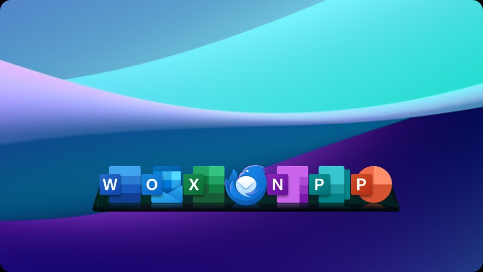
The onboarding experience was surprisingly smooth. Installation was quick, and within minutes, I had my first dock appearing on my screen. It presented a default set of icons, and the real magic began as I started dragging and dropping my most frequently used applications onto it. The immediate visual feedback, the subtle animations as icons settled into place, and the magnification effect when I hovered over them felt incredibly satisfying. My first real task was to consolidate my core marketing toolkit. I created a primary “Quick Launch” dock and filled it with Chrome, my email client, my project management software, Slack, and Photoshop. Then, I tackled the client-specific chaos. This is where the “Tabbed Docks” feature truly shone. I created a tabbed dock for “Client A,” and within it, I dragged shortcuts to their specific brand assets folder, their analytics dashboard bookmark, their social media scheduling tool, and the folder containing their ongoing campaign reports. I repeated this for “Client B” and “Client C.” The ability to neatly tuck away these client-specific resources into organized tabs, accessible with a single click, was a revelation. My honest reaction was a mix of relief and genuine surprise. The desktop, which had been a visual battleground, instantly cleared up. My taskbar, once a sprawling line of icons, suddenly looked almost empty. The functionality was immediately usable; I didn’t need to spend hours configuring or learning complex commands. It felt intuitive, like an extension of how I naturally wanted to organize things. One specific detail that truly surprised me was the depth of customization available for the dock’s appearance. I could change the size of the icons, their transparency, the dock’s background, and even the animation style. This meant I could make it blend seamlessly with my existing desktop wallpaper or stand out prominently, depending on my preference. It wasn’t just functional; it was aesthetically pleasing.
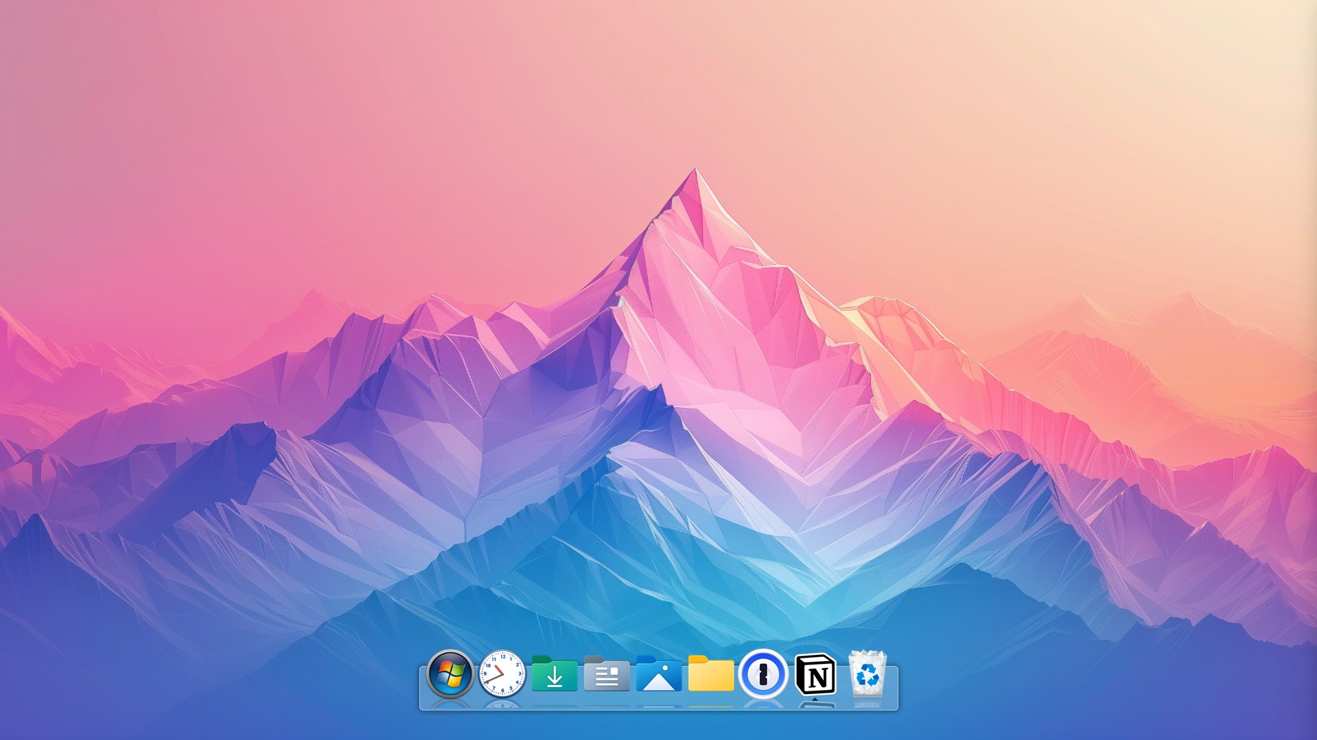
Now, ObjectDock is an indispensable part of my daily workflow. My main Windows taskbar is almost barren, usually only housing File Explorer, Outlook, and occasionally Teams if I’m in a heavy meeting day. All my essential applications and client-specific resources live in various docks. My primary quick-launch dock, typically positioned at the bottom or side of my main monitor, holds my core applications – my web browsers, video editing software, image manipulation tools, and my main CRM. Beyond that, I leverage multiple tabbed docks, each dedicated to a different aspect of my work. I have a “Current Clients” dock with tabs for each active client, containing direct links to their project folders, specific web applications, and communication channels. Another dock is dedicated to “Content Creation Tools,” housing shortcuts to my various AI writing assistants, stock photo libraries, and graphic design software. I even have a “Personal Projects” dock for my side hustles and learning resources. This setup allows me to switch contexts with incredible speed and efficiency. If I need to jump from drafting an email for Client A to reviewing analytics for Client B, it’s literally two clicks – one to open the “Current Clients” dock, and another to select the appropriate tab. This significantly reduces the mental friction of switching gears. I often use the “hide when not in use” feature for client-specific docks, so they only pop up when I hover my mouse over their designated area, keeping my screen perfectly clean and distraction-free when I’m focused on a single task.
The area where ObjectDock truly excels is providing rapid, visual access to frequently used applications and files, especially when you need to categorize and switch between different sets of tools depending on the task at hand. It has significantly cut down my “finding a file or launching an application” time. What used to be a minute or two of navigating folders or typing into the search bar has become a swift, almost instantaneous click. For instance, when I’m about to start a social media campaign for a client, I used to open my social media scheduler, then a separate tab for their brand guidelines, then navigate to their image assets folder, then open my content calendar spreadsheet. Now, all those resources are grouped under a single tab within my “Client X” dock. It’s a single click to open the dock, another click on the tab, and then I can launch all four items in rapid succession. This efficiency gain isn’t just about saving seconds; it’s about maintaining focus and reducing the cognitive load that comes with constant searching. I would estimate it saves me at least 30-45 minutes every day, simply by making my digital workspace more organized and accessible. This might not sound like much, but over a week, it’s several hours, and over a month, it’s almost a full workday saved. My old process was a constant battle against digital entropy, a never-ending cycle of opening, closing, and re-opening windows. Now, my desktop is clean, my taskbar is minimal, and my workflow feels like a well-oiled machine.
However, it’s not a complete panacea, and there are areas where it doesn’t quite replace traditional file management. While it’s fantastic for launching specific shortcuts, it’s not designed to be a full-fledged file browser. If I need to delve deep into a complex folder structure, perhaps searching for a specific historical document that isn’t a frequently accessed shortcut, I still open File Explorer. It’s also important to note that while the customization options are extensive, getting the exact visual style and behavior you want can take a bit of experimentation. The sheer number of options for icon size, effects, transparency, and dock positioning, while powerful, can be a little overwhelming initially. There’s a slight learning curve to mastering all the visual nuances and behaviors, especially if you want to create a truly bespoke setup. For example, getting the “always on top” versus “hide when using other applications” behavior perfectly tuned for each dock took a bit of trial and error. Sometimes, if I load a tabbed dock with an excessive number of icons, the scrolling behavior can feel a tiny bit sluggish, though this is a rare occurrence as I try to keep my docks focused. Despite these minor points, the improvement over my old, haphazard system is monumental. The quality of my work has indirectly improved because I spend less time on administrative tasks and more time on creative and strategic thinking. My old process was akin to working at a perpetually messy desk; now, it feels like I have a perfectly organized, custom-built workspace.
One thing that genuinely annoyed me for a brief period was after a major Windows feature update. For some reason, my primary dock’s position shifted slightly, and a few of my custom transparency settings reverted to default. It wasn’t a catastrophic issue, but it required about five minutes of readjustment to get it back to my preferred setup. It doesn’t happen often, perhaps once every six months with a significant OS update, but it’s a minor frustration when it does. I also sometimes wish there were a few more “subtle” or “professional” animation styles beyond some of the more playful, bouncy effects. While I’ve found settings that work for me, the default animations lean a bit more towards aesthetic flair than pure functional minimalism. However, these are truly minor quibbles in the grand scheme of things.
Considering the significant time savings, the reduction in daily frustration, and the overall improvement in my digital workspace’s efficiency and aesthetics, the pricing for ObjectDock feels completely justified. It’s a relatively small investment for a tool that fundamentally changes how I interact with my computer on a daily basis. For a freelancer like me, where time literally translates to billable hours, the return on investment is almost immediate. It’s part of a larger suite of tools Stardock offers, but even as a standalone product, it holds its own. Despite its utility, there are still situations where I find myself reverting to old habits. For instance, if I’m searching for a very specific, obscure file that I know is buried deep within a client’s archived project from two years ago, I won’t rely on ObjectDock. I’ll still open File Explorer and use its robust search capabilities to comb through nested folders. ObjectDock is for frequent access, for the 90% of my daily interactions. The remaining 10% still falls to the traditional Windows search and file system. It’s not a complete replacement for every aspect of Windows navigation, nor does it claim to be, but it handles the vast majority of my immediate access needs with elegance and speed. I’m currently experimenting with creating a dedicated dock for my personal development resources – things like programming guides, online course links, and e-books – to keep that learning separate and easily accessible, without it bleeding into my client-focused workspace. It’s another small step towards an even more streamlined and focused digital environment.
