


For years, my Windows desktop was less a workspace and more a digital landfill. I’m a content strategist and project manager, which means my daily routine involves a relentless barrage of documents, spreadsheets, image assets, meeting notes, research papers, and communication logs. Each client project, each internal initiative, seemed to spawn its own collection of files, and despite my best intentions, they’d inevitably end up scattered across my desktop, buried deep in labyrinthine folder structures, or lost in the purgatory of my downloads folder. My taskbar was a perpetually overflowing river of open applications, each vying for attention, their icons a chaotic mosaic of blues, greens, and oranges. I’d have five Chrome windows open, each with twenty tabs, alongside three Word documents, two Excel sheets, a couple of Figma designs, Slack, Teams, and an email client, all minimized or overlapping in a desperate attempt to keep them accessible.
The real problem wasn’t just aesthetics; it was a profound drain on my productivity and mental energy. I’d spend precious minutes, sometimes an hour or more each day, just searching for a specific file or trying to locate the right application window. Imagine needing to reference a client’s brand guidelines while simultaneously drafting a social media calendar and reviewing performance analytics. In my old setup, this meant alt-tabbing through dozens of windows, clicking through endless folders in File Explorer, and often just giving up and re-downloading a document I knew I already had somewhere. I tried everything: meticulously naming files (which I’d then forget the name of), creating elaborate folder hierarchies (which I’d then ignore), and even using sticky notes on my physical monitor to remind myself where certain digital assets were. I dabbled with various free desktop organizers, but they were often clunky, visually unappealing, or lacked the deep integration I needed. My workflow was a constant state of context switching, each switch costing me focus and momentum. The breaking point arrived during a particularly demanding quarter when I was managing three major client launches simultaneously. I missed a critical detail in a contract because I couldn’t find the correct version of a document quickly enough, leading to a frantic scramble and a very tense phone call. That day, I vowed to find a comprehensive solution.
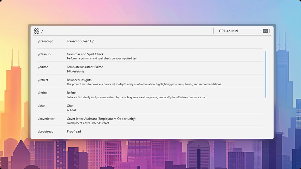
I discovered Object Desktop during one of those late-night internet rabbit holes, fueled by coffee and desperation. I was specifically searching for “Windows desktop organization tools” and “productivity suites for multiple PCs” because I also frequently switch between my main desktop and a powerful laptop for client presentations. The Stardock website itself, with its focus on “productivity and personalization suite for Windows,” immediately caught my eye. It didn’t look like a flashy, overhyped startup site; it had a more established, almost utilitarian feel, which paradoxically lent it credibility. It promised to tackle not just desktop clutter but also application management, Start Menu functionality, and even multi-PC control. My first impression was that it seemed almost too comprehensive, like it was trying to do too much. Could one suite really handle all these disparate aspects of Windows enhancement without feeling bloated or buggy? I was skeptical, but the sheer frustration of my existing setup pushed me past any reservations. The idea of a unified approach, rather than cobbling together half a dozen different utilities, was incredibly appealing. I decided to give it a try, reasoning that the potential time savings far outweighed the cost of entry. My initial thought after seeing the product page and a few screenshots was that this Object Desktop review might actually be worth writing if it delivered even half of its promises.
The onboarding experience for Object Desktop isn’t a single, monolithic installation, which makes sense given it’s a suite of several distinct applications. Instead, you download the main Object Desktop installer, which then acts as a hub to install and manage its various components: Fences, Start11, Groupy, Multiplicity, and others. I started with Fences, as desktop organization was my most immediate pain point. The setup was straightforward; I installed it, and within minutes, my desktop icons, which previously blanketed my screen like digital confetti, were automatically grouped into shaded, resizable areas called “fences.” It was like someone had waved a magic wand and instantly categorized years of accumulated digital detritus. My first real output was watching my “Documents” fence populate with all my Word and PDF files, my “Images” fence gather all my screenshots and client logos, and a “Programs” fence neatly arrange my most used applications. The immediate visual clarity was astonishing. I could finally see my desktop wallpaper again! The biggest surprise was the “peek” feature, where you can double-click the desktop to hide all fences and icons, revealing a pristine desktop, and double-click again to bring them back. This felt incredibly powerful, like having a secret, clean workspace always at my fingertips.
Next, I tackled Start11. My biggest gripe with the standard Windows Start Menu was its lack of customization and its tendency to bury essential features. With Start11, I could completely overhaul its appearance and functionality. I opted for a classic Windows 7-style menu, but with modern search capabilities and custom shortcuts. I pinned network drives, specific project folders, and even my most used web applications directly to it. The ability to sync these settings across my devices, a feature exclusive to the full suite, was a godsend. No more configuring my Start Menu twice. Then came Groupy, which, I have to admit, I initially underestimated. The concept of adding tabs to application windows seemed novel but potentially unnecessary. How wrong I was. Groupy allows you to group multiple application windows into a single tabbed interface, much like a web browser. I found myself grouping all my research documents (PDFs, browser windows, Word docs) for a specific client into one tabbed window. When I needed to switch to another project, I’d minimize that group and open another for my content creation apps. This drastically reduced the visual clutter on my taskbar and, more importantly, minimized context switching. Instead of hunting for individual windows, I was managing coherent “workspaces” for each task.
My daily workflow is now fundamentally different thanks to Object Desktop. Fences handles the passive organization of my desktop. I’ve set up automation rules that automatically sort new files into specific fences based on their file type, name, or origin. For example, all screenshots automatically go into an “Screenshots” fence, which then links to a dedicated folder in my cloud storage. All client-specific documents from a certain folder automatically appear in their respective client fence. This saves me at least 30-45 minutes a day that I used to spend manually dragging and dropping files, or worse, forgetting where I saved something and having to search through my entire hard drive. It’s not just about saving time; it’s about reducing the mental load of constant micro-decisions about where to put things. My desktop is no longer a source of anxiety but a well-oiled machine.
What Object Desktop does exceptionally well is consolidate disparate elements of Windows UI and workflow into a cohesive, customizable experience. For me, the standout feature is the combination of Fences and Groupy. Fences keeps my static desktop organized, while Groupy dynamically manages my active applications. I can create a Groupy tab for “Client A Content Creation” that includes my CMS, a Photoshop window, and a browser with their brand assets. Simultaneously, I can have another Groupy tab for “Client B Analytics Review” with my analytics dashboard, an Excel sheet, and a reporting tool. Switching between these complex tasks is now a single click on a tab, rather than a frantic alt-tabbing session across twenty individual windows. This has cut down my context switching time by probably 70% for complex multi-app tasks, allowing me to maintain focus for longer periods.
However, it’s not without its quirks. While the suite as a whole is powerful, sometimes the individual components feel like distinct applications that happen to be bundled together, rather than a single, perfectly integrated super-app. For instance, there are occasional minor UI inconsistencies between the settings panels of Fences and Start11, which isn’t a huge issue but noticeable if you’re deep in configuration. Also, the automation rules in Fences, while incredibly powerful, can take a bit of trial and error to get exactly right. There have been a few instances where a file ended up in the wrong fence because my rule was too broad or too specific, requiring me to go back and tweak the conditions. This isn’t a deal-breaker, but it means the initial setup isn’t entirely “set it and forget it” for advanced users. Compared to my old process of endless manual organization and chaotic window management, Object Desktop is light years ahead. The quality of my work has improved because I spend less time searching and more time focusing. The cost comparison is simple: the hours I save each week translate directly into more billable hours or more time for strategic thinking, making the subscription feel entirely justified.
One thing that genuinely annoyed me in the early days was the initial investment of time required to truly customize everything. While the basic features are quick to set up, unlocking the full potential of Fences’ automation rules, Start11’s deep customization, and Groupy’s tab management takes a dedicated afternoon or two. It’s not a tool you just install and forget; it demands that you think about your workflow and configure it to match. For someone already overwhelmed, finding that block of time can be a hurdle. Once it’s done, though, the returns are immense. The pricing, which is a subscription for the full suite, feels entirely justified given the productivity gains. It’s an investment in my efficiency, and it pays for itself many times over in saved time and reduced stress. There are definitely cheaper, individual tools out there that do one specific thing, but the power of the suite comes from its comprehensive approach.
Despite its capabilities, there are still situations where I find myself doing things the old way, or at least a variation of it. For example, very specific client-mandated file naming conventions that don’t quite fit into a broad automation rule might still require manual review. Or, if I’m collaborating with someone who doesn’t use Object Desktop, I sometimes have to temporarily disable some of my more aggressive organization features so their screen-sharing experience isn’t too disorienting. It’s a minor point, but it reminds me that while the tool is incredibly powerful for my workflow, it operates within a broader ecosystem. The ability to quickly toggle features on and off helps here, but it’s not always a seamless transition. I’m currently exploring how to better integrate Multiplicity into my setup, as I have a second PC I use for resource-intensive tasks, and controlling both with a single keyboard and mouse could be the next frontier in streamlining my physical and digital workspaces even further. The idea of seamlessly moving my cursor between screens as if they were one extended desktop without any additional hardware cables is something I’m quite keen to try.
Additional workflow notes before choosing Object Desktop
The biggest reason Object Desktop deserves a longer look is that it is not just one tweak for one Windows annoyance. It is a bundle decision. If someone only wants a different Start menu, Start11 alone may be the cleaner buy. If the real issue is that Windows feels scattered across the desktop, file piles, tabs, visual style, and wallpaper habits, the suite starts to make more sense. That is the useful buying question: are you solving one irritation, or are you trying to rebuild the way Windows feels every day?
For a productivity buyer, the most practical value is consistency. A Start menu change can reduce friction, Fences can reduce desktop clutter, Groupy can make app switching less chaotic, and the visual tools can make the environment feel less temporary. None of those pieces should be treated as magic. The suite is only worth it if you will actually configure the tools and keep using them after the novelty wears off. That means setting aside a real setup session instead of installing everything and hoping it fixes the workflow by itself.
I would also be cautious about buying Object Desktop only because the feature list looks long. Bundles are strongest when the included apps solve connected problems. They are weaker when half the apps become shelfware. The best fit is a Windows user who works at the same machine for hours, cares about desktop organization, and wants a more personalized workspace without replacing Windows entirely. If that describes your setup, it is worth checking the current Object Desktop options before buying separate tools one by one.
